Appearance
线性渐变
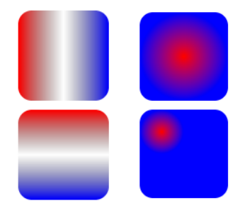
SVG 除了可以简单的填充和描边,还支持在填充和描边上应用渐变色。渐变有两种类型:线性渐变 和 径向渐变。
编写渐变时,必须给渐变内容指定一个 id 属性,use 引用需用到。
建议渐变内容定义在<defs>标签内部,渐变通常是可复用的。
线性渐变,是沿着直线改变颜色。下面看一下线性渐变的使用步骤:
- 第 1 步:在 SVG 文件的 defs 元素内部,创建一个<linearGradient>节点,并添加 id 属性。
- 第 2 步:在<linearGradient>内编写几个<stop>结点。
- 给<stop> 结点指定位置 offset 属性和 颜色 stop-color 属性,用来指定渐变在特定的位置上应用什么颜色
- offset 和 stop-color 这两个属性值,也可以通过 CSS 来指定。
- 也可通过 stop-opacity 来设置某个位置的半透明度。
- 第 3 步:在一个元素的 fill 属性或 stroke 属性中通过 ID 来引用 <linearGradient> 节点。
- 比如:属性 fill 属性设置为 url( #Gradient2 )即可。
- 第 4 步(可选):控制渐变方向,通过 ( x1, y1 ) 和 ( x2, y2 ) 两个点控制。
- (0, 0) (0, 1)从上到下;(0, 0)(1, 0)从左到右。
- 当然也可以通过 gradientTransform 属性 设置渐变形变。比如: gradientTransform=“rotate(90)” 从上到下。
html
<!DOCTYPE html>
<html lang="en">
  <head>
    <meta charset="UTF-8" />
    <meta http-equiv="X-UA-Compatible" content="IE=edge" />
    <meta name="viewport" content="width=device-width, initial-scale=1.0" />
    <title>Document</title>
    <style>
      body,
      ul {
        margin: 0;
        padding: 0;
      }

      body {
        background-image: url(../images/grid.png);
      }
      svg {
        background-color: rgba(255, 0, 0, 0.1);
      }
    </style>
  </head>
  <body>
    <svg width="300" height="300" xmlns="http://www.w3.org/2000/svg">
      <!-- 定义可以复用的元素: 样式, 渐变, 图形, 滤镜... -->
      <defs>
        <!-- 默认的渐变色 -->
        <linearGradient id="gradient1">
          <stop offset="0%" stop-color="red"></stop>
          <stop offset="50%" stop-color="green"></stop>
          <stop offset="100%" stop-color="blue"></stop>
        </linearGradient>

        <!-- 这个是指定渐变的方向 -->
        <linearGradient id="gradient2" x1="0" y1="0" x2="1" y2="1">
          <stop offset="0%" stop-color="red"></stop>
          <stop offset="50%" stop-color="green"></stop>
          <stop offset="100%" stop-color="blue"></stop>
        </linearGradient>

        <!-- 通过形变 渐变色(了解 ) -->
        <linearGradient id="gradient3" gradientTransform="rotate(0)">
          <stop offset="0%" stop-color="red"></stop>
          <stop offset="50%" stop-color="green"></stop>
          <stop offset="100%" stop-color="blue"></stop>
        </linearGradient>
      </defs>

      <rect x="0" y="0" width="100" height="50" fill="url(#gradient3)"></rect>
    </svg>
  </body>
</html>
SVG 毛玻璃效果
在前端开发中,毛玻璃效果有几种方案来实现:
方案一:使用 CSS 的 backdrop-filter 或 filter 属性
- **backdrop-filter:**可以给一个元素后面区域添加模糊效果。
- 适用于元素背后的所有元素。为了看到效果,必须使元素或其背景至少部分透明。
- **filter:**直接将模糊或颜色偏移等模糊效果应用于指定的元素。
html
<!DOCTYPE html>
<html lang="en">
  <head>
    <meta charset="UTF-8" />
    <meta http-equiv="X-UA-Compatible" content="IE=edge" />
    <meta name="viewport" content="width=device-width, initial-scale=1.0" />
    <title>Document</title>
    <style>
      body {
        margin: 0;
        padding: 0;
      }
      .box {
        position: relative;
        width: 200px;
        height: 200px;
      }

      .bg-cover {
        position: absolute;
        left: 0;
        top: 0;
        width: 100%;
        height: 100%;

        /* 做毛玻璃效果 */
        background-color: transparent;
        backdrop-filter: blur(8px);
      }
    </style>
  </head>
  <body>
    <div class="box">
      <img src="../images/avatar.jpeg" alt="" />
      <div class="bg-cover"></div>
    </div>
  </body>
</html>
filter
html
<!DOCTYPE html>
<html lang="en">
  <head>
    <meta charset="UTF-8" />
    <meta http-equiv="X-UA-Compatible" content="IE=edge" />
    <meta name="viewport" content="width=device-width, initial-scale=1.0" />
    <title>Document</title>
    <style>
      body {
        margin: 0;
        padding: 0;
      }
      .box {
        position: relative;
        width: 200px;
        height: 200px;
        /* 超出去的模糊效果 隐藏掉 */
        overflow: hidden;
      }

      img {
        /* 毛玻璃效果 */
        filter: blur(8px);
      }
    </style>
  </head>
  <body>
    <div class="box">
      <img src="../images/avatar.jpeg" alt="" />
    </div>
  </body>
</html>
方案二:使用 SVG 的 filter 和 feGaussianBlur 元素(建议少用)
< filter>:元素作为滤镜操作的容器,该元素定义的滤镜效果需要在 SVG 元素上的 filter 属性引用。
x , y, width, height 定义了在画布上应用此过滤器的矩形区域。x, y 默认值为 -10%(相对自身);width ,height 默认
值为 120% (相对自身) 。
< feGaussianBlur >:该滤镜专门对输入图像进行高斯模糊
- stdDeviation 熟悉指定模糊的程度
<feOffset> :该滤镜可以对输入图像指定它的偏移量。
html
<!DOCTYPE html>
<html lang="en">
  <head>
    <meta charset="UTF-8" />
    <meta http-equiv="X-UA-Compatible" content="IE=edge" />
    <meta name="viewport" content="width=device-width, initial-scale=1.0" />
    <title>Document</title>
    <style>
      body,
      ul {
        margin: 0;
        padding: 0;
      }

      body {
        /* background-image: url(../images/grid.png); */
      }
      svg {
        /* background-color: rgba(255, 0, 0, 0.1); */
      }
    </style>
  </head>
  <body>
    <svg width="200" height="200" xmlns="http://www.w3.org/2000/svg">
      <defs>
        <!-- 高斯模糊的 效果 -->
        <filter id="blurFilter">
          <!--  ......  -->
          <feGaussianBlur stdDeviation="8"></feGaussianBlur>
        </filter>
      </defs>
      <image
        href="../images/avatar.jpeg"
        width="200"
        height="200"
        filter="url(#blurFilter)"
      ></image>
    </svg>
  </body>
</html>
html
<!DOCTYPE html>
<html lang="en">
  <head>
    <meta charset="UTF-8" />
    <meta http-equiv="X-UA-Compatible" content="IE=edge" />
    <meta name="viewport" content="width=device-width, initial-scale=1.0" />
    <title>Document</title>
    <style>
      body,
      ul {
        margin: 0;
        padding: 0;
      }

      body {
        /* background-image: url(../images/grid.png); */
      }
      svg {
        /* background-color: rgba(255, 0, 0, 0.1); */
      }
    </style>
  </head>
  <body>
    <svg width="200" height="200" xmlns="http://www.w3.org/2000/svg">
      <defs>
        <!-- 高斯模糊的 效果 -->
        <filter id="blurFilter" x="50%" y="50%" width="50%" height="25%">
          <feGaussianBlur stdDeviation="8"></feGaussianBlur>
        </filter>
      </defs>
      <image
        href="../images/avatar.jpeg"
        width="200"
        height="200"
        filter="url(#blurFilter)"
      ></image>
    </svg>
  </body>
</html>
javascript
x="50%" y="50%" width="50%" height="25%" 偏移效果如下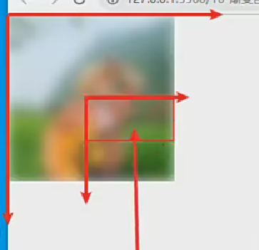
形变- transform
transform 属性用来定义元素及其子元素的形变的列表。
此属性可以与任何一个 SVG 中的元素一起使用。如果使用了变形,会在该元素内部建立了一个新的坐标系统。
从 SVG2 开始,transform 它是一个 Presentation Attribute,意味着它可以用作 CSS 属性。
但是 transform 作为 CSS 属性和元素属性之间的语法会存在一些差异。
比如作为元素属性时:支持 2D 变换,不需单位,rotate 可指定旋转原点。
transform 属性支持的函数:
- translate(x, y) 平移。
- rotate(z) / rotate(z, cx,cy) :旋转。
- scale(x, y) :缩放
- skew(x, y) :倾斜。
- matrix(a, b, c, d, e) : 2*3 的形变矩阵
注意:形变会不会修改坐标系? 会,形变元素内部会建立一个新的坐标系,后续的绘图或形变都会参照新的坐标系。
形变-平移
平移:把元素移动一段距离, 使用 transform 属性的 translate()函数来平移元素。
与 CSS 的 translate 相似但有区别,这里只支持 2D 变换,不需单位。
translate(x, y)函数
- 一个值时,设置 x 轴上的平移,而第二个值默认赋值为 0
- 二个值时,设置 x 轴和 y 轴上的平移
注意:平移会不会修改坐标系? 会,元素内部会建立一个新的坐标系。
html
<!DOCTYPE html>
<html lang="en">
  <head>
    <meta charset="UTF-8" />
    <meta http-equiv="X-UA-Compatible" content="IE=edge" />
    <meta name="viewport" content="width=device-width, initial-scale=1.0" />
    <title>Document</title>
    <style>
      body,
      ul {
        margin: 0;
        padding: 0;
      }

      body {
        background-image: url(../images/grid.png);
      }
      svg {
        background-color: rgba(255, 0, 0, 0.1);
      }
    </style>
  </head>
  <body>
    <svg width="300" height="300" xmlns="http://www.w3.org/2000/svg">
      <!-- 1.平移一个元素 -->
      <!-- <rect x="0" y="0" width="100" height="50"
      transform="translate(200, 200)"
    >
    </rect> -->

      <!-- 2.平移一个元素, 在元素的内部会创建一个新的坐标系统 -->
      <!-- <rect
      transform="translate(100, 100)"
      x="-10" y="-10" width="100" height="50"
    >
    </rect> -->

      <!-- 2.平移一个元素, 在元素的内部会创建一个新的坐标系统 -->
      <g transform="translate(100, 100)">
        <rect x="10" y="10" width="100" height="50"></rect>
      </g>
    </svg>
  </body>
</html>
形变-旋转
旋转:把元素旋转指定的角度, 使用 transform 属性的 rotate(deg,cx, cy) 函数来旋转元素。
与 CSS 的 rotate 相似但有区别。区别是:支持 2D 变换,不需单位,可指定旋转原点。
rotate(deg, cx, cy) 函数
一个值时,设置 z 轴上的旋转的角度。
注意:
- 旋转会不会修改坐标系? 会,坐标轴也会跟着旋转了
- 如何指定旋转原点? 直接在 rotate 中指定 cx ,cy(相对于自身); 或者使用 CSS 样式写动画。
html
<!DOCTYPE html>
<html lang="en">
  <head>
    <meta charset="UTF-8" />
    <meta http-equiv="X-UA-Compatible" content="IE=edge" />
    <meta name="viewport" content="width=device-width, initial-scale=1.0" />
    <title>Document</title>
    <style>
      body,
      ul {
        margin: 0;
        padding: 0;
      }

      body {
        background-image: url(../images/grid.png);
      }
      svg {
        background-color: rgba(255, 0, 0, 0.1);
      }
    </style>
  </head>
  <body>
    <svg width="300" height="300" xmlns="http://www.w3.org/2000/svg">
      <!-- 1.旋转一个元素 -->
      <!-- <rect
      transform="rotate(45, 50, 25) translate(100, 0)"
      x="0" y="0" width="100" height="50"
    >
    </rect> -->

      <rect
        transform="translate(100, 0) rotate(45, 50, 25)"
        x="0"
        y="0"
        width="100"
        height="50"
      ></rect>
    </svg>
  </body>
</html>
形变-缩放
缩放:改变元素尺寸,使用 transform 属性的 scale() 函数来缩放元素。
与 CSS 的 scale 相似但有区别,这只支持 2D 变换,不需单位。
scale(x, y)函数
- 二个值时:它需要两个数字,作为比率计算如何缩放。0.5 表示收缩到 50%。
- 一个值时:第二个数字被忽略了,它默认等于第一个值。
注意:
- 缩放会不会修改坐标系?会,坐标轴被缩放了。
- 如何指定缩放的原点? SVG 属性实现需要 平移坐标 和 移动图形了;或者 直接使用 CSS 来写动画
html
<!DOCTYPE html>
<html lang="en">
  <head>
    <meta charset="UTF-8" />
    <meta http-equiv="X-UA-Compatible" content="IE=edge" />
    <meta name="viewport" content="width=device-width, initial-scale=1.0" />
    <title>Document</title>
    <style>
      body,
      ul {
        margin: 0;
        padding: 0;
      }

      body {
        background-image: url(../images/grid.png);
      }
      svg {
        background-color: rgba(255, 0, 0, 0.1);
      }
    </style>
  </head>
  <body>
    <svg width="300" height="300" xmlns="http://www.w3.org/2000/svg">
      <!-- 1.缩放一个元素 -->
      <!-- <rect
      transform="translate(100, 100) scale(1, 2)"
      x="0" y="0" width="100" height="50"
    >
    </rect> -->

      <!-- 2.修改缩放的原点 -->
      <!-- <rect
      transform="translate(100, 100) scale(2)"
      x="-25" y="-25" width="50" height="50"
    >
    </rect> -->

      <!-- 3.修改缩放的原点 -->
      <g transform="scale(2)">
        <rect
          transform="translate(10, 0)"
          x="0"
          y="0"
          width="50"
          height="50"
        ></rect>
      </g>
    </svg>
  </body>
</html>
stroke 描边动画
stroke 是描边属性,专门给图形描边。如果想给各种描边添加动画效果,需用到下面两个属性:
- stroke-dasharray =“number [, number , ….]”: 将虚线类型应用在描边上。
- 该值必须是用逗号分割的数字组成的数列,空格会被忽略。比如 3,5 :
- 第一个表示填色区域的长度为 3
- 第二个表示非填色区域的长度为 5
- stroke-dashoffset:指定在 dasharray 模式下路径的偏移量。
- 值为 number 类型,除了可以正值,也可以取负值。
描边动画实现步骤:
- 1.先将描边设置为虚线
- 2.接着将描边偏移到不可见处
- 3.通过动画让描边慢慢变为可见,这样就产生了动画效果了。
两种实现方法:
html
<!DOCTYPE html>
<html lang="en">
  <head>
    <meta charset="UTF-8" />
    <meta http-equiv="X-UA-Compatible" content="IE=edge" />
    <meta name="viewport" content="width=device-width, initial-scale=1.0" />
    <title>Document</title>
    <style>
      body,
      ul {
        margin: 0;
        padding: 0;
      }
      body {
        background-image: url(../images/grid.png);
      }
      svg {
        background-color: rgba(255, 0, 0, 0.1);
      }

      #line1 {
        /* 指定为虚线 */
        stroke-dasharray: 100px;
        /* 可见 */
        stroke-dashoffset: 0px;
        animation: line1Move 2s linear;
      }

      @keyframes line1Move {
        0% {
          /* 不可见 */
          stroke-dashoffset: 100px;
        }

        100% {
          /* 可见 */
          stroke-dashoffset: 0px;
        }
      }
    </style>
  </head>
  <body>
    <svg width="300" height="300" xmlns="http://www.w3.org/2000/svg">
      <!--
      stroke , 而不是 fill
     -->
      <line
        id="line1"
        x1="100"
        y1="70"
        x2="200"
        y2="70"
        stroke="red"
        stroke-width="10"
      ></line>
    </svg>
  </body>
</html>
html
<!DOCTYPE html>
<html lang="en">
  <head>
    <meta charset="UTF-8" />
    <meta http-equiv="X-UA-Compatible" content="IE=edge" />
    <meta name="viewport" content="width=device-width, initial-scale=1.0" />
    <title>Document</title>
    <style>
      body,
      ul {
        margin: 0;
        padding: 0;
      }
      body {
        background-image: url(../images/grid.png);
      }
      svg {
        background-color: rgba(255, 0, 0, 0.1);
      }

      #line1 {
        /* 指定为虚线 */
        stroke-dasharray: 100px;
        /* 不可见 */
        stroke-dashoffset: 100px;
        animation: line1Move 2s linear forwards;
      }
      @keyframes line1Move {
        100% {
          stroke-dashoffset: 0px; /* 可见 */
        }
      }
    </style>
  </head>
  <body>
    <svg width="300" height="300" xmlns="http://www.w3.org/2000/svg">
      <!--
      stroke , 而不是 fill
     -->
      <line
        id="line1"
        x1="100"
        y1="70"
        x2="200"
        y2="70"
        stroke="red"
        stroke-width="10"
      ></line>
    </svg>
  </body>
</html>
路径-描边案例
雪糕路径描边动画案例实现步骤:
- 1.找到一个雪糕的 SVG 图片(设计师提供 | 网站下载)
- 2.将雪糕的每一个路径都改成虚线
- 3.将每个路径的描边都移动到虚线的空白处(不可见)
- 4.给每个路径添加动画,将路径描边慢慢移动到虚线填充处,即可。
html
<!DOCTYPE html>
<html lang="en">
  <head>
    <meta charset="UTF-8" />
    <meta http-equiv="X-UA-Compatible" content="IE=edge" />
    <meta name="viewport" content="width=device-width, initial-scale=1.0" />
    <title>Document</title>
    <!-- 0,  1.75 800,  2.5 200 -->
    <style>
      .inside-r,
      .inside-l,
      .drop,
      .stick,
      .outline {
        animation: lineMove 2s linear forwards;
      }
      .outline {
        /* 虚线  1019 */
        stroke-dasharray: 1020px;
        /* 不可见 */
        stroke-dashoffset: 1020px;
      }

      .stick {
        /* 这里本来是给 252px就行了,但是我们给800, 想加速 */
        stroke-dasharray: 800px;
        /* 不可见 */
        stroke-dashoffset: 800px;
        /* animation: lineMove 2s linear forwards; */
        animation-delay: 1.75s;
      }

      .drop {
        stroke-dasharray: 200px;
        stroke-dashoffset: 200px;
        /* animation: lineMove 2s linear forwards; */
        animation-delay: 2.5s;
      }

      .inside-l {
        stroke-dasharray: 800px;
        stroke-dashoffset: 800px;
        /* animation: lineMove 2s linear forwards; */
        animation-delay: 1s;
      }

      .inside-r {
        stroke-dasharray: 700px;
        stroke-dashoffset: 700px;
        /* animation: lineMove 2s linear forwards; */
      }

      @keyframes lineMove {
        100% {
          /* 可见 */
          stroke-dashoffset: 0px;
        }
      }
    </style>
  </head>
  <body>
    <svg
      id="popsicle"
      width="300"
      height="400"
      xmlns="http://www.w3.org/2000/svg"
      viewBox="0 0 177.3 449.1"
    >
      <g stroke="black" stroke-width="5px">
        <!-- 手柄 -->
        <path
          class="stick"
          d="M408.8,395.9V502.4a18.8,18.8,0,0,1-18.8,18.8h0a18.8,18.8,0,0,1-18.8-18.8V415.3"
          transform="translate(-301.2 -73.5)"
          fill="none"
        />
        <!-- 水滴 -->
        <path
          class="drop"
          d="M359.1,453.5c0,3.1-2.1,5.6-4.7,5.6s-4.7-2.5-4.7-5.6,2.1-8.3,4.7-8.3S359.1,450.4,359.1,453.5Z"
          transform="translate(-301.2 -73.5)"
          fill="none"
        />
        <!-- 外层 -->
        <path
          class="outline"
          d="M389.9,75h0a87.4,87.4,0,0,0-87.2,87.2v218a15.7,15.7,0,0,0,15.7,15.7h12a4.3,4.3,0,0,1,4.1,4.8h0.1v17c0,8.2,9.1,7.9,9.1,0v-6c0-5.2,5.8-5.2,5.8,0v20.5c0,7.7,9.8,7.7,9.8,0V407.2c0-5.2,6.4-5.2,6.4,0v2.7c0,7.7,8.8,7.7,8.8,0v-6c0-6.4,3.9-7.8,6-8.1h80.9a15.7,15.7,0,0,0,15.7-15.7v-218A87.4,87.4,0,0,0,389.9,75Z"
          transform="translate(-301.2 -73.5)"
          fill="none"
        />

        <!-- 里面左边 -->
        <path
          class="inside-l"
          d="M55.5,68h0A20.2,20.2,0,0,1,75.7,88.2V276.9a4.5,4.5,0,0,1-4.5,4.5H39.8a4.5,4.5,0,0,1-4.5-4.5V88.2A20.2,20.2,0,0,1,55.5,68Z"
          fill="none"
        />
        <!-- 里面左边 -->
        <path
          class="inside-r"
          d="M121.8,68h0A20.2,20.2,0,0,1,142,88.2V277a4.4,4.4,0,0,1-4.4,4.4H106.1a4.4,4.4,0,0,1-4.4-4.4V88.2A20.2,20.2,0,0,1,121.8,68Z"
          fill="none"
        />
      </g>
    </svg>

    <script>
      window.onload = function () {
        getPathLength("stick"); // 252px
        getPathLength("drop"); // 36
        getPathLength("outline"); // 1019
        getPathLength("inside-l"); // 486
        getPathLength("inside-r"); // 486
      };

      function getPathLength(className) {
        let stickEl = document.getElementsByClassName(className)[0];
        let stickLength = stickEl.getTotalLength();
        console.log(className + "Length=", stickLength);
      }
    </script>
  </body>
</html>
什么是 SMIL?
SMIL(Synchronized Multimedia Integration Language 同步多媒体集成语言)是 W3C 推荐的可扩展标记语言,用于描述多媒体演示。
- SMIL 标记是用 XML 编写的,与 HTML 有相似之处。
- SMIL 允许开发多媒体项目,例如:文本、图像、视频、音频等。
- SMIL 定义了时间、布局、动画、视觉转换和媒体嵌入等标记,比如:<head> <body> <seq> <par> <excl> 等元素
SMIL 的应用
- 目前最常用的 Web 浏览器基本都支持 SMIL 语言。
- SVG 动画元素是基于 SMIL 实现(SVG 中使用 SMIL 实现元素有:<set>、< animate >、< animateMotion >...)。
- Adobe Media Player implement SMIL playback。
- QuickTime Player implement SMIL playback。
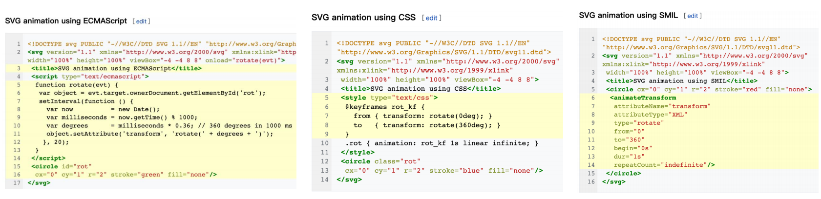
SVG 动画实现方式
SVG 是一种基于 XML 的开放标准矢量图形格式,动画可以通过多种方式实现:
**1.用 JS 脚本实现:**可以直接通过 JavaScript 在来给 SVG 创建动画和开发交互式的用户界面。
**2.用 CSS 样式实现:**自 2008 年以来,CSS 动画已成为 WebKit 中的一项功能,使得我们可以通过 CSS 动画的方式来给文档对象
模型(DOM) 中的 SVG 文件编写动态效果。
3.用 SMIL 实现:一种基于 SMIL 语言实现的 SVG 动画。
SMIL 动画的优势
SVG 用 SMIL 方式实现动画,SMIL 允许你做下面这些事情:
- 变动一个元素的数字属性(x、y……)
- 变动变形属性(translation 或 rotation)
- 变动颜色属性
- 物件方向与运动路径方向同步等等
SMIL 方式实现动画的优势:
只需在页面放几个 animate 元素就可以实现强大的动画效果,无需任何 CSS 和 JS 代码。
SMIL 支持声明式动画。声明式动画不需指定如何做某事的细节,而是指定最终结果应该是什么,将实现细节留给客户端软件
在 JavaScript 中,动画通常使用 setTimeout() 或 setInterval() 等方法创建,这些方法需要手动管理动画的时间。而 SMIL
声明式动画可以让浏览器自动处理,比如:动画轨迹直接与动画对象相关联、物体和运动路径方向、管理动画时间等等。
SMIL 动画还有一个令人愉快的特点是,动画与对象本身是紧密集成的,对于代码的编写和阅读性都非常好。
SMIL 动画的元素
SVG 中支持 SMIL 动画的元素:
javascript
<set> <animate> <animateColor> <animateMotion>更多:https://www.w3.org/TR/SVG11/animate.html#AnimationElements
Set 元素
<set>元素提供了一种简单的方法,可以在指定的时间内设置属性的值。
set 元素是最简单的 SVG 动画元素。它是在经过特定时间间隔后,将属性设置为某个值(不是过度动画效果)。因此,图像
不是连续动画,而是改变一次属性值。
它支持所有属性类型,包括那些无法合理插值的属性类型,例如:字符串 和 布尔值。而对于可以合理插值的属性通常首选
<animate>元素。
<set>元素常用属性:
- attributeName:指示将在动画期间更改的目标元素的 CSS 属性( property )或属性( attribute )的名称。
- attributeType: (已过期,不推荐)指定定义目标属性的类型(值为:CSS | XML | auto)。
- to : 定义在特定时间设置目标属性的值。该值必须与目标属性的要求相匹配。 值类型:<anything>;默认值:无
- begin:定义何时开始动画或何时丢弃元素,默认是 0s ( begin 支持多种类型的值 )。
<set>案例:
1)在 3 秒后自动将长方形瞬间移到右边
2)点击长方形后,长方形瞬间移到右边
html
<!DOCTYPE html>
<html lang="en">
  <head>
    <meta charset="UTF-8" />
    <meta http-equiv="X-UA-Compatible" content="IE=edge" />
    <meta name="viewport" content="width=device-width, initial-scale=1.0" />
    <title>Document</title>
    <style>
      body,
      ul {
        margin: 0;
        padding: 0;
      }

      body {
        background-image: url(../images/grid.png);
      }
      svg {
        background-color: rgba(255, 0, 0, 0.1);
      }
    </style>
  </head>
  <body>
    <svg width="300" height="300" xmlns="http://www.w3.org/2000/svg">
      <rect x="0" y="0" width="100" height="50" fill="red">
        <set attributeName="x" to="200" begin="3s"></set>
      </rect>
    </svg>

    <svg width="300" height="300" xmlns="http://www.w3.org/2000/svg">
      <rect id="rectangle" x="0" y="0" width="100" height="50" fill="green">
        <set attributeName="x" to="200" begin="rectangle.click"></set>
      </rect>
    </svg>
  </body>
</html>
Animate 元素
<animate>元素给某个属性创建过度动画效果。需将 animate 元素嵌套在要应用动画的元素内。
<animate>元素常用属性:
attributeName:指将在动画期间更改目标元素的 property (CSS 属)或 attribute 的名称。
动画值属性:
- from:在动画期间将被修改的属性的初始值。没有默认值。
- to :在动画期间将被修改的属性的最终值。没有默认值。
- values:该属性具有不同的含义,具体取决于使用它的上下文(没有默认值) 。
- 它定义了在动画过度中使用的一系列值,值需要用分号隔开,比如:values=“2 ; 3; 4; 5”。
- 当 values 属性定义时,from、to 会被忽略。
动画时间属性:
- begin:定义何时开始动画或何时丢弃元素。默认是 0s 。
- dur:动画的持续时间,该值必须,并要求大于 0。单位可以用小时 ( h)、分钟 ( m)、秒 ( s) 或毫秒 ( ms) 表示。
- fill:定义动画的最终状态。 freeze(保持最后一个动画帧的状态) | remove(保持第一个动画帧的状态)
- repeatCount:指示动画将发生的次数:<number> | indefinite。没有默认值。
html
<!DOCTYPE html>
<html lang="en">
  <head>
    <meta charset="UTF-8" />
    <meta http-equiv="X-UA-Compatible" content="IE=edge" />
    <meta name="viewport" content="width=device-width, initial-scale=1.0" />
    <title>Document</title>
    <style>
      body,
      ul {
        margin: 0;
        padding: 0;
      }

      body {
        background-image: url(../images/grid.png);
      }
      svg {
        background-color: rgba(255, 0, 0, 0.1);
      }
    </style>
  </head>
  <body>
    <svg width="300" height="200" xmlns="http://www.w3.org/2000/svg">
      <rect x="0" y="0" width="100" height="50" fill="red">
        <!--
        1.animate 元素的基本使用
       -->
        <!-- <animate
        attributeName="x"
        form="0"
        to="200"
        dur="3s"
        begin="2s"
        fill="freeze"
      > -->
        <!--
        2.animate 元素的基本使用(3个属性时必须的)
       -->
        <animate attributeName="x" to="200" dur="3s"></animate>
      </rect>
    </svg>

    <svg width="300" height="200" xmlns="http://www.w3.org/2000/svg">
      <rect x="0" y="0" width="100" height="50" fill="green">
        <!--
        form: 0
        to: 200
       -->
        <animate
          attributeName="x"
          values="0; 170; 200"
          dur="3s"
          repeatCount="indefinite"
        ></animate>

        <!-- 这里的red;green是根据fill来的 -->
        <animate
          attributeName="fill"
          values="red;green"
          dur="3s"
          repeatCount="indefinite"
        ></animate>
      </rect>
    </svg>

    <svg width="300" height="200" xmlns="http://www.w3.org/2000/svg">
      <rect x="0" y="0" width="100" height="50" fill="pink">
        <animate
          id="oneAnimate"
          attributeName="x"
          values="0;200"
          dur="3s"
          fill="freeze"
        ></animate>

        <!-- oneAnimate.end指的是等上面动画执行完再执行这个动画 -->
        <animate
          attributeName="y"
          values="0;100"
          dur="3s"
          fill="freeze"
          begin="oneAnimate.end"
        ></animate>
      </rect>
    </svg>
  </body>
</html>
animateTransform 元素
< animateTransform >元素
- 指定目标元素的形变(transform)属性,从而允许控制元素的平移、旋转、缩放或倾斜动画(类似于 CSS3 的形变)。
- 在一个动画元素中,只能用一个< animateTransform >元素创建动画;存在多个时,后面会覆盖前面的动画。
< animateTransform >元素常用属性:
attributeName:指示将在动画期间更改的目标元素的 CSS 属性( property )或属性( attribute )的名称。
type :一个指定类型的属性,在不同的使用场景下,有不同的意思:
- 在<animateTransform>元素,只支持 translate(x, y) | rotate(deg, cx, cy) | scale(x, y) | skewX(x) | skewY(y) 。
- 在 HTML 中的 <style > 和 <script > 元素,它定义了元素内容的类型。
动画值属性:from、to 、values
动画时间属性:begin、dur、fill、repeatCount
平移
html
<!DOCTYPE html>
<html lang="en">
  <head>
    <meta charset="UTF-8" />
    <meta http-equiv="X-UA-Compatible" content="IE=edge" />
    <meta name="viewport" content="width=device-width, initial-scale=1.0" />
    <title>Document</title>
    <style>
      body,
      ul {
        margin: 0;
        padding: 0;
      }

      body {
        background-image: url(../images/grid.png);
      }
      svg {
        background-color: rgba(255, 0, 0, 0.1);
      }
    </style>
  </head>
  <body>
    <svg width="300" height="200" xmlns="http://www.w3.org/2000/svg">
      <rect x="0" y="0" width="100" height="50" fill="red">
        <animateTransform
          attributeName="transform"
          type="translate"
          from="0, 0"
          to="200, 0"
          dur="2s"
          begin="1s"
          repeatCount="indefinite"
        ></animateTransform>
      </rect>
    </svg>

    <svg width="300" height="200" xmlns="http://www.w3.org/2000/svg">
      <rect x="0" y="0" width="100" height="50" fill="red">
        <animateTransform
          attributeName="transform"
          type="translate"
          values="0 0;200 0"
          dur="2s"
          begin="1s"
          repeatCount="indefinite"
        ></animateTransform>
      </rect>
    </svg>
  </body>
</html>
旋转
html
<!DOCTYPE html>
<html lang="en">
  <head>
    <meta charset="UTF-8" />
    <meta http-equiv="X-UA-Compatible" content="IE=edge" />
    <meta name="viewport" content="width=device-width, initial-scale=1.0" />
    <title>Document</title>
    <style>
      body,
      ul {
        margin: 0;
        padding: 0;
      }

      body {
        background-image: url(../images/grid.png);
      }
      svg {
        background-color: rgba(255, 0, 0, 0.1);
      }
    </style>
  </head>
  <body>
    <svg width="300" height="300" xmlns="http://www.w3.org/2000/svg">
      <rect x="0" y="0" width="50" height="50" fill="red">
        <animateTransform
          attributeName="transform"
          type="rotate"
          from="0 150 150"
          to="360 150 150"
          dur="20s"
          begin="1s"
          repeatCount="indefinite"
        ></animateTransform>
      </rect>
    </svg>

    <!-- <svg width="300" height="200" xmlns="http://www.w3.org/2000/svg" >
    <rect x="0" y="0" width="100" height="50" fill="red">
      <animateTransform
        attributeName="transform"
        type="rotate"
        values="0 50 25;-360 50 25"
        dur="2s"
        begin="1s"
        repeatCount="indefinite"
      >
      </animateTransform>
    </rect>
  </svg> -->
  </body>
</html>
缩放
html
<!DOCTYPE html>
<html lang="en">
  <head>
    <meta charset="UTF-8" />
    <meta http-equiv="X-UA-Compatible" content="IE=edge" />
    <meta name="viewport" content="width=device-width, initial-scale=1.0" />
    <title>Document</title>
    <style>
      body,
      ul {
        margin: 0;
        padding: 0;
      }

      body {
        background-image: url(../images/grid.png);
      }
      svg {
        background-color: rgba(255, 0, 0, 0.1);
      }
    </style>
  </head>
  <body>
    <svg width="300" height="200" xmlns="http://www.w3.org/2000/svg">
      <rect x="0" y="0" width="100" height="50" fill="red">
        <animateTransform
          attributeName="transform"
          type="scale"
          from="1 1"
          to="1 3"
          dur="2s"
          begin="1s"
          repeatCount="indefinite"
        ></animateTransform>
      </rect>
    </svg>

    <svg width="300" height="200" xmlns="http://www.w3.org/2000/svg">
      <rect x="0" y="0" width="100" height="50" fill="red">
        <animateTransform
          attributeName="transform"
          type="scale"
          values="1;0.5"
          dur="2s"
          begin="1s"
          repeatCount="indefinite"
        ></animateTransform>
      </rect>
    </svg>
  </body>
</html>
animateMotion 元素
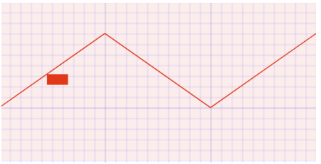
< animateMotion > 定义了一个元素如何沿着运动路径进行移动。
动画元素的坐标原点,会影响元素运动路径,建议从(0, 0)开始。
要复用现有路径,可在<animateMotion>元素中使用<mpath>元素。
< aniamteMotion >元素常用属性:
path:定义运动的路径,值和<path >元素的 d 属性一样,也可用 href 引用 一个 <path>。
rotate :动画元素自动跟随路径旋转,使元素动画方向和路径方向相同,值类型:<数字> | auto | auto-reverse; 默认值:0
动画值属性: from、to 、values
动画时间属性: begin、dur、fill、repeatCount
html
<!DOCTYPE html>
<html lang="en">
  <head>
    <meta charset="UTF-8" />
    <meta http-equiv="X-UA-Compatible" content="IE=edge" />
    <meta name="viewport" content="width=device-width, initial-scale=1.0" />
    <title>Document</title>
    <style>
      body,
      ul {
        margin: 0;
        padding: 0;
      }

      body {
        background-image: url(../images/grid.png);
      }
      svg {
        background-color: rgba(255, 0, 0, 0.1);
      }
    </style>
  </head>
  <body>
    <svg width="300" height="300" xmlns="http://www.w3.org/2000/svg">
      <!-- 画一条路径 -->
      <path
        d="M 0 100, L 100 30, L 200 100, L 300 30"
        fill="transparent"
        stroke="red"
      ></path>

      <!--
      repeatCount="indefinite"
     -->
      <rect x="0" y="0" width="20" height="10" rx="4" ry="4" fill="red">
        <animateMotion
          path="M 0 100, L 100 30, L 200 100, L 300 30"
          dur="5s"
          rotate="auto"
        ></animateMotion>
      </rect>
    </svg>
  </body>
</html>
复用路径
html
<!DOCTYPE html>
<html lang="en">
  <head>
    <meta charset="UTF-8" />
    <meta http-equiv="X-UA-Compatible" content="IE=edge" />
    <meta name="viewport" content="width=device-width, initial-scale=1.0" />
    <title>Document</title>
    <style>
      body,
      ul {
        margin: 0;
        padding: 0;
      }

      body {
        background-image: url(../images/grid.png);
      }
      svg {
        background-color: rgba(255, 0, 0, 0.1);
      }
    </style>
  </head>
  <body>
    <svg width="300" height="300" xmlns="http://www.w3.org/2000/svg">
      <!-- 画一条路径 -->
      <path
        id="linePath"
        d="M 0 100, L 100 30, L 200 100, L 300 30"
        fill="transparent"
        stroke="red"
      ></path>

      <!--
      repeatCount="indefinite"
     -->
      <rect x="0" y="0" width="20" height="10" rx="4" ry="4" fill="red">
        <animateMotion dur="5s" rotate="auto">
          <mpath href="#linePath"></mpath>
        </animateMotion>
      </rect>
    </svg>
  </body>
</html>
优化,animateMotion 可以写在 rect 外面
html
<!DOCTYPE html>
<html lang="en">
  <head>
    <meta charset="UTF-8" />
    <meta http-equiv="X-UA-Compatible" content="IE=edge" />
    <meta name="viewport" content="width=device-width, initial-scale=1.0" />
    <title>Document</title>
    <style>
      body,
      ul {
        margin: 0;
        padding: 0;
      }

      body {
        background-image: url(../images/grid.png);
      }
      svg {
        background-color: rgba(255, 0, 0, 0.1);
      }
    </style>
  </head>
  <body>
    <svg width="300" height="300" xmlns="http://www.w3.org/2000/svg">
      <!-- 1.图形 -->
      <path
        id="linePath"
        d="M 0 100, L 100 30, L 200 100, L 300 30"
        fill="transparent"
        stroke="red"
      ></path>
      <rect
        id="rectangle"
        x="-10"
        y="-5"
        width="20"
        height="10"
        rx="4"
        ry="4"
        fill="red"
      ></rect>

      <!-- 2.动画 -->
      <animateMotion href="#rectangle" dur="5s" rotate="auto" fill="freeze">
        <mpath href="#linePath"></mpath>
      </animateMotion>
    </svg>
  </body>
</html>
SVG + SMIL 动画
案例 1:飞机沿轨迹飞行动画

html
<!DOCTYPE html>
<html lang="en">
  <head>
    <meta charset="UTF-8" />
    <meta http-equiv="X-UA-Compatible" content="IE=edge" />
    <meta name="viewport" content="width=device-width, initial-scale=1.0" />
    <title>Document</title>
  </head>
  <body>
    <svg width="400" height="200" viewBox="0 0 3387 1270">
      <defs>
        <style>
          svg {
            background-color: #28505d;
          }
          /**飞机飞行路线**/
          .planePath {
            stroke: #d9dada;
            stroke-width: 0.5%;
            stroke-dasharray: 1% 2%;
            stroke-linecap: round;
            fill: none;
          }
          /**飞机颜色**/
          .fil1 {
            fill: #d9dada;
          }
          .fil2 {
            fill: #c5c6c6;
          }
          .fil4 {
            fill: #9d9e9e;
          }
          .fil3 {
            fill: #aeafb0;
          }
        </style>
      </defs>

      <!-- 飞行路径 -->
      <path
        id="planePath"
        class="planePath"
        d="M-226 626c439,4 636,-213 934,-225 755,-31 602,769 1334,658 562,-86 668,-698 266,-908 -401,-210 -893,189 -632,630 260,441 747,121 1051,91 360,-36 889,179 889,179"
      />

      <!-- 飞机图形-->
      <g id="plane">
        <polygon
          class="fil1"
          points="-141,-10 199,0 -198,-72 -188,-61 -171,-57 -184,-57 "
        />
        <polygon class="fil2" points="199,0 -141,-10 -163,63 -123,9 " />
        <polygon
          class="fil3"
          points="-95,39 -113,32 -123,9 -163,63 -105,53 -108,45 -87,48 -90,45 -103,41 -94,41 "
        />
        <path
          class="fil4"
          d="M-87 48l-21 -3 3 8 19 -4 -1 -1zm-26 -16l18 7 -2 -1 32 -7 -29 1 11 -4 -24 -1 -16 -18 10 23zm10 9l13 4 -4 -4 -9 0z"
        />
        <polygon
          class="fil1"
          points="-83,28 -94,32 -65,31 -97,38 -86,49 -67,70 199,0 -123,9 -107,27 "
        />
      </g>

      <!-- 动画效果 -->
      <animateMotion
        href="#plane"
        dur="6s"
        rotate="auto"
        repeatCount="indefinite"
      >
        <mpath href="#planePath"></mpath>
      </animateMotion>
    </svg>
  </body>
</html>
上面这些 svg 代码是设计师提供的,我们只需要加动画效果就行了。
案例 2:加载进度动画
html
<!DOCTYPE html>
<html lang="en">
  <head>
    <meta charset="UTF-8" />
    <meta http-equiv="X-UA-Compatible" content="IE=edge" />
    <meta name="viewport" content="width=device-width, initial-scale=1.0" />
    <title>Document</title>
    <style>
      body {
        margin: 0;
        padding: 0;
        background-color: #e74c3c;
      }
      svg {
        margin: 40px;
      }
    </style>
  </head>
  <body>
    <!-- 1)音乐播放动画-->
    <svg
      xmlns="http://www.w3.org/2000/svg"
      width="80"
      height="100"
      viewBox="0 0 80 100"
    >
      <!-- line 1 -->
      <rect fill="#fff" width="3" height="100" transform="rotate(180,3,50)">
        <animate
          attributeName="height"
          values="30; 100; 30"
          dur="1s"
          repeatCount="indefinite"
          begin="0s"
        ></animate>
      </rect>
      <!-- line2 -->
      <rect
        x="17"
        fill="#fff"
        width="3"
        height="100"
        transform="rotate(180 20 50)"
      >
        <animate
          attributeName="height"
          values="30; 100; 30"
          dur="1s"
          repeatCount="indefinite"
          begin="0.1s"
        ></animate>
      </rect>
      <!-- line3 -->
      <rect
        x="40"
        fill="#fff"
        width="3"
        height="100"
        transform="rotate(180,40,50)"
      >
        <animate
          attributeName="height"
          values="30; 100; 30"
          dur="1s"
          repeatCount="indefinite"
          begin="0.3s"
        ></animate>
      </rect>
      <!-- line4 -->
      <rect
        x="60"
        fill="#fff"
        width="3"
        height="100"
        transform="rotate(180 58 50)"
      >
        <animate
          attributeName="height"
          values="30; 100; 30"
          dur="1s"
          repeatCount="indefinite"
          begin="0.5s"
        ></animate>
      </rect>
      <!-- line4 -->
      <rect
        x="80"
        fill="#fff"
        width="3"
        height="100"
        transform="translate(0) rotate(180 76 50)"
      >
        <animate
          attributeName="height"
          values="30; 100; 30"
          dur="1s"
          repeatCount="indefinite"
          begin="0.1s"
        ></animate>
      </rect>
    </svg>

    <!-- 2.进度条动画 -->
    <svg
      xmlns="http://www.w3.org/2000/svg"
      width="100"
      height="100"
      viewBox="0 0 100 100"
    >
      <circle fill="#fff" stroke="none" cx="6" cy="50" r="6">
        <animate
          attributeName="opacity"
          values="0;1;0"
          dur="1s"
          begin="0s"
          repeatCount="indefinite"
        ></animate>
      </circle>
      <circle fill="#fff" stroke="none" cx="26" cy="50" r="6">
        <animate
          attributeName="opacity"
          values="0;1;0"
          dur="1s"
          begin="0.1s"
          repeatCount="indefinite"
        ></animate>
      </circle>
      <circle fill="#fff" stroke="none" cx="46" cy="50" r="6">
        <animate
          attributeName="opacity"
          values="0;1;0"
          dur="1s"
          begin="0.2s"
          repeatCount="indefinite"
        ></animate>
      </circle>
    </svg>

    <!-- 3.转动动画 -->
    <svg
      xmlns="http://www.w3.org/2000/svg"
      width="100"
      height="100"
      viewBox="0 0 100 100"
    >
      <!-- big circle -->
      <circle
        fill="none"
        stroke="#fff"
        stroke-width="6"
        stroke-miterlimit="15"
        stroke-dasharray="14.2472,14.2472"
        cx="50"
        cy="50"
        r="47"
      >
        <animateTransform
          attributeName="transform"
          type="rotate"
          values="0 50 50;360 50 50"
          dur="5s"
          repeatCount="indefinite"
        ></animateTransform>
      </circle>

      <!-- small circle -->
      <circle
        fill="none"
        stroke="#fff"
        stroke-width="1"
        stroke-miterlimit="10"
        stroke-dasharray="10,10"
        cx="50"
        cy="50"
        r="39"
      >
        <animateTransform
          attributeName="transform"
          type="rotate"
          values="0 50 50;-360 50 50"
          dur="5s"
          repeatCount="indefinite"
        ></animateTransform>
      </circle>

      <!-- rect -->
      <g fill="#fff">
        <rect x="30" y="35" width="5" height="30">
          <animateTransform
            attributeName="transform"
            type="translate"
            values="0 -5; 0 5; 0 -5"
            dur="1s"
            begin="0s"
            repeatCount="indefinite"
          ></animateTransform>
        </rect>
        <rect x="40" y="35" width="5" height="30">
          <animateTransform
            attributeName="transform"
            type="translate"
            values="0 -5; 0 5; 0 -5"
            dur="1s"
            begin="0.1s"
            repeatCount="indefinite"
          ></animateTransform>
        </rect>
        <rect x="50" y="35" width="5" height="30">
          <animateTransform
            attributeName="transform"
            type="translate"
            values="0 -5; 0 5; 0 -5"
            dur="1s"
            begin="0.2s"
            repeatCount="indefinite"
          ></animateTransform>
        </rect>
        <rect x="60" y="35" width="5" height="30">
          <animateTransform
            attributeName="transform"
            type="translate"
            values="0 -5; 0 5; 0 -5"
            dur="1s"
            begin="0.3s"
            repeatCount="indefinite"
          ></animateTransform>
        </rect>
        <rect x="70" y="35" width="5" height="30">
          <animateTransform
            attributeName="transform"
            type="translate"
            values="0 -5; 0 5; 0 -5"
            dur="1s"
            begin="0.4s"
            repeatCount="indefinite"
          ></animateTransform>
        </rect>
      </g>
    </svg>
  </body>
</html>
SVG + CSS3 动画

html
<!DOCTYPE html>
<html lang="en">
  <head>
    <meta charset="UTF-8" />
    <meta http-equiv="X-UA-Compatible" content="IE=edge" />
    <meta name="viewport" content="width=device-width, initial-scale=1.0" />
    <title>Document</title>
    <style>
      .first-box {
        width: 600px;
        height: 314px;
        background: url(./images/bg-location.png);
        background-size: 100% 100%;
      }

      /* 定位的 icon */
      #loc1 {
        animation: moveLoc1Icon1 1s linear infinite alternate;
      }
      #loc2 {
        animation: moveLoc1Icon2 1s linear infinite alternate;
        animation-delay: 0.3s;
      }

      @keyframes moveLoc1Icon1 {
        0% {
          transform: translateY(-20px);
        }
        100% {
          transform: translateY(0px);
        }
      }
      @keyframes moveLoc1Icon2 {
        0% {
          transform: translateY(0px);
        }
        100% {
          transform: translateY(10px);
        }
      }

      #c1 {
        animation: scaleEllipse1 2s linear infinite;
      }

      #c2 {
        animation: scaleEllipse2 2s linear infinite;
        animation-delay: 1s;
      }

      #c3,
      #c4 {
        animation: scaleEllipse3 2s linear infinite;
      }

      #c4 {
        animation-delay: 1s;
      }

      @keyframes scaleEllipse1 {
        0% {
          rx: 0;
          ry: 0;
          opacity: 1;
        }
        100% {
          rx: 16;
          ry: 8;
          opacity: 0;
        }
      }
      @keyframes scaleEllipse2 {
        0% {
          rx: 0;
          ry: 0;
          opacity: 1;
        }
        100% {
          rx: 12;
          ry: 6;
          opacity: 0;
        }
      }
      @keyframes scaleEllipse3 {
        0% {
          rx: 0;
          ry: 0;
          opacity: 1;
        }
        100% {
          rx: 10;
          ry: 5;
          opacity: 0;
        }
      }
    </style>
  </head>
  <body>
    <div class="box-left first-box">
      <svg
        id="location"
        height="400"
        version="1.1"
        width="744"
        xmlns="http://www.w3.org/2000/svg"
      >
        <desc>Created with Snap</desc>
        <defs>
          <linearGradient
            x1="100%"
            y1="40.7087699%"
            x2="4.9797314%"
            y2="60.8683027%"
            id="linearGradient-1"
          >
            <stop stop-color="#F5533D" stop-opacity="0" offset="0%"></stop>
            <stop stop-color="#F5533D" offset="44.5180532%"></stop>
            <stop stop-color="#F5533D" stop-opacity="0" offset="100%"></stop>
          </linearGradient>
        </defs>
        <image
          id="loc1"
          xlink:href="./images/redPoint.png"
          preserveAspectRatio="none"
          x="265"
          y="50.275"
          width="55"
          height="74"
        ></image>
        <image
          id="loc2"
          xlink:href="./images/smPoint.png"
          preserveAspectRatio="none"
          x="155"
          y="69.97776888888889"
          width="25"
          height="34"
        ></image>
        <image
          id="loc3"
          xlink:href="./images/smPoint.png"
          preserveAspectRatio="none"
          x="435"
          y="90.35983743115371"
          width="25"
          height="34"
        ></image>
        <image
          xlink:href=" ./images/bg-red.png"
          preserveAspectRatio="none"
          x="278"
          y="94"
          width="30"
          height="100"
        ></image>
        <image
          xlink:href=" ./images/bg-red.png"
          preserveAspectRatio="none"
          x="160"
          y="94"
          width="15"
          height="50"
        ></image>
        <image
          xlink:href="./images/first-smbg.png"
          preserveAspectRatio="none"
          x="438"
          y="125"
          width="20"
          height="20"
        ></image>
        <ellipse
          id="c1"
          cx="293"
          cy="187"
          rx="8.106666666666667"
          ry="3.546666666666667"
          fill="rgba(0,0,0,0)"
          stroke="#ff0000"
          style="opacity: 0.493333"
        ></ellipse>
        <ellipse
          id="c2"
          cx="293"
          cy="187"
          rx="0"
          ry="0"
          fill="rgba(0,0,0,0)"
          stroke="#ff0000"
          style="opacity: 1"
        ></ellipse>
        <ellipse
          id="c3"
          cx="168"
          cy="143"
          rx="0"
          ry="0"
          fill="rgba(0,0,0,0)"
          stroke="#ff0000"
          style="opacity: 1"
        ></ellipse>
        <ellipse
          id="c4"
          cx="168"
          cy="143"
          rx="6.08"
          ry="2.5333333333333337"
          fill="rgba(0,0,0,0)"
          stroke="#ff0000"
          style="opacity: 0.493333"
        ></ellipse>
      </svg>
    </div>
  </body>
</html>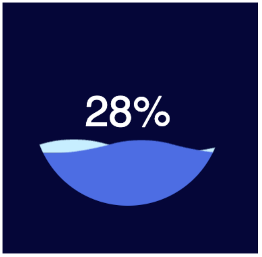
html
<!DOCTYPE html>
<html lang="en">
  <head>
    <meta charset="UTF-8" />
    <meta http-equiv="X-UA-Compatible" content="IE=edge" />
    <meta name="viewport" content="width=device-width, initial-scale=1.0" />
    <title>Document</title>
    <style>
      *,
      *:before,
      *:after {
        box-sizing: border-box;
        outline: none;
      }
      body {
        background: #020438;
        font: 14px/1 "Open Sans", helvetica, sans-serif;
      }
      .box {
        height: 280px;
        width: 280px;
        position: absolute;
        top: 50%;
        left: 50%;
        transform: translate(-50%, -50%);
        background: #020438;
        border-radius: 100%;
        overflow: hidden;
      }
      .box .percent {
        position: absolute;
        left: 0;
        top: 0;
        z-index: 3;
        width: 100%;
        height: 100%;
        display: -webkit-box;
        display: -ms-flexbox;
        display: flex;
        display: -webkit-flex;
        align-items: center;

        justify-content: center;
        color: #fff;
        font-size: 64px;
      }
      .box .water {
        position: absolute;
        left: 0;
        top: 0;
        z-index: 2;
        width: 100%;
        height: 100%;
        transform: translate(0, 50%);
        background: #4d6de3;
      }
      .box .water_wave {
        width: 200%;
        position: absolute;
        bottom: 100%;
      }
      .box .water_wave_back {
        right: 0;
        fill: #c7eeff;
        animation: moveWaveBack 1.7s linear infinite;
      }
      .box .water_wave_front {
        left: 0;
        fill: #4d6de3;
        margin-bottom: -1px;
        animation: moveWaveFront 0.7s linear infinite;
      }
      @keyframes moveWaveBack {
        0% {
          transform: translateX(0);
        }
        100% {
          transform: translateX(50%);
        }
      }
      @keyframes moveWaveFront {
        0% {
          transform: translateX(0);
        }
        100% {
          transform: translateX(-50%);
        }
      }
    </style>
  </head>
  <body>
    <div class="water-ball">
      <svg
        version="1.1"
        xmlns="https://www.w3.org/2000/svg"
        xmlns:xlink="https://www.w3.org/1999/xlink"
        x="0px"
        y="0px"
        style="display: none"
      >
        <!-- 定义可复用的 icon -->
        <symbol id="wave">
          <path
            d="M420,20c21.5-0.4,38.8-2.5,51.1-4.5c13.4-2.2,26.5-5.2,27.3-5.4C514,6.5,518,4.7,528.5,2.7c7.1-1.3,17.9-2.8,31.5-2.7c0,0,0,0,0,0v20H420z"
          ></path>
          <path
            d="M420,20c-21.5-0.4-38.8-2.5-51.1-4.5c-13.4-2.2-26.5-5.2-27.3-5.4C326,6.5,322,4.7,311.5,2.7C304.3,1.4,293.6-0.1,280,0c0,0,0,0,0,0v20H420z"
          ></path>
          <path
            d="M140,20c21.5-0.4,38.8-2.5,51.1-4.5c13.4-2.2,26.5-5.2,27.3-5.4C234,6.5,238,4.7,248.5,2.7c7.1-1.3,17.9-2.8,31.5-2.7c0,0,0,0,0,0v20H140z"
          ></path>
          <path
            d="M140,20c-21.5-0.4-38.8-2.5-51.1-4.5c-13.4-2.2-26.5-5.2-27.3-5.4C46,6.5,42,4.7,31.5,2.7C24.3,1.4,13.6-0.1,0,0c0,0,0,0,0,0l0,20H140z"
          ></path>
        </symbol>
      </svg>
      <div class="box">
        <div class="percent">
          <div class="percentNum" id="count">0</div>
          <div class="percentB">%</div>
        </div>
        <div id="water" class="water">
          <svg viewBox="0 0 560 20" class="water_wave water_wave_back">
            <use xlink:href="#wave"></use>
          </svg>
          <svg viewBox="0 0 560 20" class="water_wave water_wave_front">
            <use xlink:href="#wave"></use>
          </svg>
        </div>
      </div>
    </div>

    <script>
      window.onload = function () {
        var countEL = document.getElementById("count");
        var waterEl = document.getElementById("water");
        var currentPercentage = 0;
        var targetPercentage = 70;

        var timeId = null;
        timeId = setInterval(function () {
          currentPercentage++; // 170
          if (currentPercentage >= targetPercentage) {
            clearInterval(timeId);
          }
          countEL.innerHTML = currentPercentage;

          if (currentPercentage <= 100) {
            waterEl.style.transform = `translateY(${100 - currentPercentage}%)`;
          }
        }, 60);
      };
    </script>
  </body>
</html>
水球体的 svg
html
<!DOCTYPE html>
<html lang="en">
  <head>
    <meta charset="UTF-8" />
    <meta http-equiv="X-UA-Compatible" content="IE=edge" />
    <meta name="viewport" content="width=device-width, initial-scale=1.0" />
    <title>Document</title>
    <style>
      *,
      *:before,
      *:after {
        box-sizing: border-box;
        outline: none;
      }
      body {
        /* background-color: black; */
      }
    </style>
  </head>
  <body>
    <svg
      version="1.1"
      xmlns="https://www.w3.org/2000/svg"
      xmlns:xlink="https://www.w3.org/1999/xlink"
      x="0px"
      y="0px"
      style="display: none"
    >
      <!-- 定义可复用的 icon -->
      <symbol id="wave">
        <path
          d="M420,20c21.5-0.4,38.8-2.5,51.1-4.5c13.4-2.2,26.5-5.2,27.3-5.4C514,6.5,518,4.7,528.5,2.7c7.1-1.3,17.9-2.8,31.5-2.7c0,0,0,0,0,0v20H420z"
        ></path>
        <path
          d="M420,20c-21.5-0.4-38.8-2.5-51.1-4.5c-13.4-2.2-26.5-5.2-27.3-5.4C326,6.5,322,4.7,311.5,2.7C304.3,1.4,293.6-0.1,280,0c0,0,0,0,0,0v20H420z"
        ></path>
        <path
          d="M140,20c21.5-0.4,38.8-2.5,51.1-4.5c13.4-2.2,26.5-5.2,27.3-5.4C234,6.5,238,4.7,248.5,2.7c7.1-1.3,17.9-2.8,31.5-2.7c0,0,0,0,0,0v20H140z"
        ></path>
        <path
          d="M140,20c-21.5-0.4-38.8-2.5-51.1-4.5c-13.4-2.2-26.5-5.2-27.3-5.4C46,6.5,42,4.7,31.5,2.7C24.3,1.4,13.6-0.1,0,0c0,0,0,0,0,0l0,20H140z"
        ></path>
      </symbol>
    </svg>

    <svg viewBox="0 0 560 20" class="water_wave water_wave_front">
      <use xlink:href="#wave"></use>
    </svg>
  </body>
</html>
Snap.svg
什么是 Snap.svg?
- Snap.svg 是一个专门用于处理 SVG 的 JavaScript 库 ( 类似 jQuery )。
- Snap 为 Web 开发人员提供了干净、直观、功能强大的 API,这些 API 专门用来操作 SVG。
- Snap 可用于创建动画,操作现有的 SVG 内容,以及生成 SVG 内容。
为什么选择 Snap.svg?
Snap 是由 Dmitry Baranovskiy 从零开始编写,专为现代浏览器(IE9 及更高版本、Safari、Chrome、Firefox 和 Opera)
而设计。并且 Snap 可以支持遮罩、剪辑、图案、全渐变、组等功能。
Snap 还有一个独特功能是能够与现有的 SVG 一起工作。意味着 SVG 内容不必使用 Snap 生成,就可使用 Snap 来处理它。
- 比如可以在 Illustrator 或 Sketch 等工具中创建 SVG 内容,然后使用 Snap 对其进行动画处理和操作。
Snap 还支持动画。提供了简单直观的与动画相关的 JavaScript API,Snap 可以帮助你的 SVG 内容更具交互性和吸引力
Snap.svg 库处理 SVG 就像 jQuery 处理 DOM 一样简单,并且 Snap 是 100% 免费和 100% 开源的。
Snap.svg 初体验
Snap.svg 常用的 API:
Snap: 工厂函数,创建或获取 SVG
- Snap(w, h) 、Snap(selector)….
Paper: 纸张 | SVG 画布
- circle、rect、line、path、text….
Element:元素
- animate、attr、select、before、after…
mina:通常用到的一些动画时间函数。
- mina.linear、mina.easeIn、mina.easeOut….
Snap 更多的 API 文档: http://snapsvg.io/docs/
初体验
html
<!DOCTYPE html>
<html lang="en">
  <head>
    <meta charset="UTF-8" />
    <meta http-equiv="X-UA-Compatible" content="IE=edge" />
    <meta name="viewport" content="width=device-width, initial-scale=1.0" />
    <title>Document</title>
  </head>
  <body>
    <script src="./libs/snap.svg-min.js"></script>
    <script>
      window.onload = function () {
        // 1.创建一个svg
        let svg = Snap(300, 300);
        // svg.paper = svg
        // console.log(svg === svg.paper) // true

        // 2.在svg画布中绘制一个圆
        // let c = svg.circle(100, 100, 50)
        let c = svg.paper.circle(100, 100, 50);

        // 3.给圆添加一些属性
        c.attr({
          fill: "red",
        });
        // 拿到svg的元素的对象
        // console.log(svg.node)
        // 4.将svg添加到body中
        document.body.appendChild(svg.node);
      };
    </script>
  </body>
</html>
操作 SVG
html
<!DOCTYPE html>
<html lang="en">
  <head>
    <meta charset="UTF-8" />
    <meta http-equiv="X-UA-Compatible" content="IE=edge" />
    <meta name="viewport" content="width=device-width, initial-scale=1.0" />
    <title>Document</title>
    <style>
      body,
      ul {
        margin: 0;
        padding: 0;
      }

      body {
        background-image: url(../images/grid.png);
      }
      svg {
        background-color: rgba(255, 0, 0, 0.1);
      }
    </style>
  </head>
  <body>
    <svg id="hySvg" width="300" height="300" xmlns="http://www.w3.org/2000/svg">
      <rect id="rectangle1" x="0" y="0" width="100" height="50"></rect>
    </svg>

    <script src="./libs/snap.svg-min.js"></script>
    <script>
      window.onload = function () {
        let svg = Snap("#hySvg");
        let paper = svg.paper;

        // 1.绘制一个矩形
        let rectangle = paper.rect(0, 100, 100, 50);
        rectangle.attr({
          fill: "red",
        });

        // 2.选择一个矩形
        let rectangle1 = paper.select("#rectangle1");
        rectangle1.attr({
          fill: "green",
        });
      };
    </script>
  </body>
</html>
动画实现
html
<!DOCTYPE html>
<html lang="en">
  <head>
    <meta charset="UTF-8" />
    <meta http-equiv="X-UA-Compatible" content="IE=edge" />
    <meta name="viewport" content="width=device-width, initial-scale=1.0" />
    <title>Document</title>
    <style>
      body,
      ul {
        margin: 0;
        padding: 0;
      }

      body {
        background-image: url(../images/grid.png);
      }
      svg {
        background-color: rgba(255, 0, 0, 0.1);
      }
    </style>
  </head>
  <body>
    <svg id="hySvg" width="300" height="300" xmlns="http://www.w3.org/2000/svg">
      <rect id="rectangle1" x="0" y="0" width="100" height="50"></rect>
    </svg>

    <script src="./libs/snap.svg-min.js"></script>
    <script>
      window.onload = function () {
        let svg = Snap("#hySvg");
        let paper = svg.paper;

        // 1.绘制一个矩形
        let rectangle = paper.rect(0, 100, 100, 50);
        rectangle.attr({
          fill: "red",
        });

        // 2.选择一个矩形
        let rectangle1 = paper.select("#rectangle1");
        rectangle1.attr({
          fill: "green",
        });

        // 3.动画的实现( requestAnimatationFrame  1s 61次)
        // Snap.animate(
        //   0, // from
        //   200, // to
        //   function(val) {
        //     console.log('val', val)
        //     // 这里会回调 61 次, 会将0-200拆分成61份
        //     rectangle1.attr({
        //       x: val
        //     })
        //   },
        //   1000, // 毫秒 -> 1s
        //   mina.linear,
        //   function() {
        //     console.log('动画结束了')
        //   }
        // )

        Snap.animate(
          [0, 0], // from x ,y
          [200, 200], // to x, y
          function (val) {
            console.log("val", val);
            // 这里会回调 61 次, 会将0-200拆分成61份
            rectangle1.attr({
              x: val[0],
              y: val[1],
            });
          },
          3000, // 毫秒 -> 1s
          mina.easeout,
          function () {
            console.log("动画结束了");
          }
        );
      };
    </script>
  </body>
</html>
SVG + Snap 动画

html
<!DOCTYPE html>
<html lang="en">
<head>
<meta charset="UTF-8" />
<meta http-equiv="X-UA-Compatible" content="IE=edge" />
<meta name="viewport" content="width=device-width, initial-scale=1.0" />
<title>Document</title>
</head>
<body>
<svg
version="1.1"
id="crocodile-2"
xmlns="http://www.w3.org/2000/svg"
xmlns:xlink="http://www.w3.org/1999/xlink"
x="0px"
y="0px"
width="375px"
height="300px"
viewBox="0 0 500 400"
enable-background="new 0 0 500 400"
xml:space="preserve"
>
<defs>
<style>
#diagram-eye {
transform-origin: 10% 30%;
}
#diagram-pie {
transform-origin: 50% 30%;
}
#diagram-map {
transform-origin: 80% 30%;
}
</style>
</defs>
<g id="croc">
<linearGradient
id="SVGID_1_"
gradientUnits="userSpaceOnUse"
x1="-352.022"
y1="820.576"
x2="-352.022"
y2="919.5"
gradientTransform="matrix(-1 0 0 1 79 -537.5)"
>
<stop offset="0" style="stop-color: #000000; stop-opacity: 0.25" />
<stop offset="0.7074" style="stop-color: #000000; stop-opacity: 0" />
</linearGradient>
<polygon
fill="url(#SVGID_1_)"
points="828.78,382 766.953,320.172 424.839,283.076 33.264,309.868 105.396,382 "
/>
<polygon
fill="#00A99D"
points="717.49,299.563 639.175,287.198 597.957,274.832 581.47,274.832 527.886,258.345 499.033,250.101
424.839,237.735 363.012,237.735 330.037,245.979 272.331,250.101 255.844,245.979 218.747,254.223 198.138,254.223
169.285,262.466 169.02,262.528 168.718,262.466 150.365,258.345 132.031,258.345 120.695,270.535 49.639,291.805 39.562,289.472
33.264,295.441 33.264,309.413 37.204,309.346 43.291,316.495 72.885,318.333 91.381,320.172 137.62,319.364 153.768,319.364
161.041,320.172 210.503,320.172 198.138,332.538 239.356,332.538 247.6,328.416 251.722,320.172 276.453,320.172 325.915,324.294
381.312,320.337 375.377,324.294 363.012,332.538 416.596,332.538 424.839,328.416 430.335,320.172 441.327,320.172
503.154,316.05 532.007,320.172 614.437,324.294 635.066,324.294 672.15,320.172 766.953,320.172 "
/>
<polygon
opacity="0.15"
fill="#FFFFFF"
enable-background="new "
points="346.524,258.345 330.037,245.979 363.012,237.735 "
/>
<polygon
opacity="0.15"
fill="#FFFFFF"
enable-background="new "
points="717.49,299.563 721.612,311.929 655.663,303.685
597.957,291.319 569.104,295.441 494.911,274.832 499.033,250.101 527.886,258.345 581.47,274.832 597.957,274.832
639.175,287.198 "
/>
<polygon
opacity="0.15"
fill="#FFFFFF"
enable-background="new "
points="499.033,250.101 433.083,250.101 424.839,237.735 "
/>
<polygon
opacity="0.15"
fill="#FFFFFF"
enable-background="new "
points="527.885,258.345 494.911,274.832 433.083,250.101
363.012,237.735 424.839,237.735 499.033,250.101 "
/>
<polygon
opacity="0.15"
fill="#FFFFFF"
enable-background="new "
points="597.957,274.832 597.957,291.319 581.47,274.832 "
/>
<polygon
opacity="0.15"
fill="#FFFFFF"
enable-background="new "
points="527.885,258.345 569.104,295.441 581.47,274.832 "
/>
<polygon
opacity="0.15"
fill="#FFFFFF"
enable-background="new "
points="527.885,258.345 494.911,274.832 437.205,262.466
420.718,274.832 346.524,258.345 272.331,250.101 330.037,245.979 363.012,237.735 424.839,237.735 499.033,250.101 "
/>
<polygon
opacity="0.15"
fill="#FFFFFF"
enable-background="new "
points="433.083,250.101 420.718,274.832 346.524,258.345
309.428,278.954 272.331,262.466 255.844,245.979 272.331,250.101 330.037,245.979 363.012,237.735 424.839,237.735
499.033,250.101 "
/>
<polygon
opacity="0.15"
fill="#FFFFFF"
enable-background="new "
points="272.331,250.101 272.331,262.466 218.747,254.223
255.844,245.979 "
/>
<polygon
opacity="0.2"
fill="#FFFFFF"
enable-background="new "
points="120.695,270.534 123.127,285.425 49.638,291.805 "
/>
<polyline
opacity="0.2"
fill="#FFFFFF"
enable-background="new "
points="49.638,291.805 62.343,298.568 120.695,270.534 "
/>
<polygon
opacity="0.2"
fill="#FFFFFF"
enable-background="new "
points="120.695,270.534 120.695,270.534 123.127,285.425
132.031,258.345 "
/>
<polygon
opacity="0.2"
fill="#FFFFFF"
enable-background="new "
points="150.365,258.345 123.127,285.425 120.695,270.534
132.031,258.345 "
/>
<polygon
fill="#FFFFFF"
points="141.617,267.138 137.495,271.26 145.739,271.26 149.861,268.676 "
/>
<polygon
opacity="0.2"
fill="#FFFFFF"
enable-background="new "
points="150.365,258.345 168.718,262.642 119.911,270.71
132.031,258.345 "
/>
<polygon
opacity="0.2"
fill="#FFFFFF"
enable-background="new "
points="49.638,291.805 33.264,295.441 39.562,289.472 "
/>
<polygon
opacity="0.15"
fill="#FFFFFF"
enable-background="new "
points="161.041,311.929 140.432,299.563 107.457,299.563
123.945,295.441 144.554,295.441 "
/>
<polygon
opacity="0.15"
fill="#FFFFFF"
enable-background="new "
points="144.554,295.441 123.945,295.441 140.432,299.563 "
/>
<polygon
opacity="0.15"
fill="#FFFFFF"
enable-background="new "
points="255.844,245.979 218.747,254.223 218.747,262.466
198.138,254.223 218.747,254.223 "
/>
<polygon
opacity="0.15"
fill="#FFFFFF"
enable-background="new "
points="218.747,254.223 218.747,262.466 169.285,270.71
132.598,258.345 152.798,258.345 169.285,262.466 198.138,254.223 "
/>
<polygon
opacity="0.15"
fill="#FFFFFF"
enable-background="new "
points="330.037,245.979 272.331,262.466 247.6,278.954
218.747,262.466 169.285,283.076 169.285,262.466 198.138,254.223 218.747,254.223 255.844,245.979 272.331,250.101 "
/>
<polygon
opacity="0.15"
fill="#FFFFFF"
enable-background="new "
points="259.966,278.954 247.6,291.319 235.235,287.198 "
/>
<polygon
opacity="0.15"
fill="#FFFFFF"
enable-background="new "
points="280.575,287.198 247.6,291.319 226.991,316.05
235.235,287.198 259.966,278.954 "
/>
<polygon
opacity="0.15"
fill="#FFFFFF"
enable-background="new "
points="210.503,320.172 206.382,332.538 198.138,332.538 "
/>
<polygon
opacity="0.15"
fill="#FFFFFF"
enable-background="new "
points="226.991,316.05 235.235,320.172 210.503,320.172 "
/>
<polygon
opacity="0.15"
fill="#FFFFFF"
enable-background="new "
points="288.819,299.563 280.575,287.198 259.966,278.954
235.235,287.198 247.6,291.319 259.966,278.954 "
/>
<polygon
opacity="0.15"
fill="#FFFFFF"
enable-background="new "
points="235.235,287.198 235.235,320.172 218.747,332.538
206.382,332.538 198.138,332.538 210.503,320.172 226.991,316.05 "
/>
<polygon
opacity="0.15"
fill="#FFFFFF"
enable-background="new "
points="466.058,270.71 445.449,287.198 433.083,278.954 "
/>
<polygon
opacity="0.15"
fill="#FFFFFF"
enable-background="new "
points="420.718,287.198 445.449,287.198 486.667,287.198
466.058,270.71 433.083,278.954 "
/>
<polygon
opacity="0.15"
fill="#FFFFFF"
enable-background="new "
points="404.23,311.929 445.449,287.198 466.058,270.71
433.083,278.954 420.718,287.198 "
/>
<polygon
opacity="0.15"
fill="#FFFFFF"
enable-background="new "
points="387.743,316.05 416.596,320.172 404.23,311.929 "
/>
<polygon
opacity="0.15"
fill="#FFFFFF"
enable-background="new "
points="379.499,332.538 375.377,324.294 363.012,332.538 "
/>
<polygon
opacity="0.15"
fill="#FFFFFF"
enable-background="new "
points="387.743,316.05 379.499,332.538 363.012,332.538
375.377,324.294 "
/>
<polygon
opacity="0.15"
fill="#FFFFFF"
enable-background="new "
points="416.596,320.172 379.499,332.538 363.012,332.538
375.377,324.294 387.743,316.05 404.23,311.929 420.718,287.198 "
/>
</g>
<polyline
id="path-eye"
opacity="0.25"
fill="none"
stroke="#000000"
stroke-width="2"
stroke-miterlimit="10"
enable-background="new "
points="
121.714,247.568 66.427,193.472 66.427,149.497 "
/>
<polyline
id="path-pie"
opacity="0.25"
fill="none"
stroke="#000000"
stroke-width="2"
stroke-miterlimit="10"
enable-background="new "
points="
272.069,237.568 226.782,193.472 226.782,155.497 "
/>
<polyline
id="path-map"
opacity="0.25"
fill="none"
stroke="#000000"
stroke-width="2"
stroke-miterlimit="10"
enable-background="new "
points="
412.069,227.568 376.782,193.472 376.782,145.497 "
/>
<g id="diagram-eye">
<linearGradient
id="SVGID_2_"
gradientUnits="userSpaceOnUse"
x1="238.8165"
y1="619.2575"
x2="320.3815"
y2="700.8225"
gradientTransform="matrix(1 0 0 1 -171 -537.5)"
>
<stop offset="0" style="stop-color: #000000; stop-opacity: 0.15" />
<stop offset="0.9331" style="stop-color: #000000; stop-opacity: 0" />
</linearGradient>
<polygon
fill="url(#SVGID_2_)"
points="91.848,220.855 10.283,139.291 125.35,24.224 206.915,105.789 "
/>
<rect x="10" y="24.507" fill="#00A99D" width="115.35" height="115.35" />
<g>
<g>
<g>
<g>
<g>
<defs>
<rect
id="SVGID_3_"
x="10"
y="24.507"
width="115.35"
height="115.35"
/>
</defs>
<clipPath id="SVGID_4_">
<use xlink:href="#SVGID_3_" overflow="visible" />
</clipPath>
<linearGradient
id="SVGID_5_"
gradientUnits="userSpaceOnUse"
x1="-288.3424"
y1="535.6428"
x2="-205.4552"
y2="618.5298"
gradientTransform="matrix(0.5689 0.1954 0.1954 0.5689 124.387 -168.8858)"
>
<stop
offset="0"
style="stop-color: #000000; stop-opacity: 0.25"
/>
<stop
offset="1"
style="stop-color: #000000; stop-opacity: 0"
/>
</linearGradient>
<polygon
clip-path="url(#SVGID_4_)"
fill="url(#SVGID_5_)"
points="106.408,162.927 44.068,100.445 96.512,68.965
149.381,121.833 "
/>
</g>
</g>
</g>
</g>
</g>
<path
fill="#60C6BA"
d="M28.023,82.182c0,0,18.023-28.837,39.652-28.837s39.652,28.837,39.652,28.837s-18.023,28.837-39.652,28.837
S28.023,82.182,28.023,82.182z"
/>
<g>
<circle fill="#9BEADF" cx="67.675" cy="82.182" r="24.031" />
</g>
<path
fill="#00A99D"
d="M67.675,65.017c0,0,3.433,6.866,3.433,17.165s-3.433,17.165-3.433,17.165s-3.433-6.866-3.433-17.165
S67.675,65.017,67.675,65.017z"
/>
<circle
opacity="0.5"
fill="#FFFFFF"
enable-background="new "
cx="57.921"
cy="67.48"
r="4.806"
/>
<circle
opacity="0.5"
fill="#FFFFFF"
enable-background="new "
cx="50.712"
cy="74.689"
r="2.403"
/>
</g>
<g id="diagram-pie">
<linearGradient
id="SVGID_6_"
gradientUnits="userSpaceOnUse"
x1="400.0527"
y1="624.0652"
x2="473.0262"
y2="697.0389"
gradientTransform="matrix(1 0 0 1 -171 -537.5)"
>
<stop offset="0" style="stop-color: #000000; stop-opacity: 0.25" />
<stop offset="0.9" style="stop-color: #000000; stop-opacity: 0" />
</linearGradient>
<path
fill="url(#SVGID_6_)"
d="M272.351,43.267l-86.596,86.597l72.973,72.973l86.596-86.596L272.351,43.267z"
/>
<circle fill="#60C6BA" cx="226.973" cy="83.304" r="61.828" />
<path
fill="#00A99D"
d="M197.727,137.784c8.708,4.684,18.665,7.347,29.246,7.347c34.146,0,61.828-27.681,61.828-61.828
s-27.681-61.828-61.828-61.828v59.767L197.727,137.784z"
/>
<g>
<g>
<g>
<g>
<g>
<defs>
<circle id="SVGID_7_" cx="226.973" cy="83.304" r="61.828" />
</defs>
<clipPath id="SVGID_8_">
<use xlink:href="#SVGID_7_" overflow="visible" />
</clipPath>
<linearGradient
id="SVGID_9_"
gradientUnits="userSpaceOnUse"
x1="397.6839"
y1="619.334"
x2="444.7831"
y2="666.433"
gradientTransform="matrix(1 0 0 1 -171 -537.5)"
>
<stop
offset="0"
style="stop-color: #000000; stop-opacity: 0.25"
/>
<stop
offset="1"
style="stop-color: #000000; stop-opacity: 0"
/>
</linearGradient>
<path
clip-path="url(#SVGID_8_)"
fill="url(#SVGID_9_)"
d="M258.189,50.329l-4.726,4.726
c6.853,6.853,11.092,16.321,11.092,26.779c0,20.916-16.955,37.871-37.871,37.871c-10.458,0-19.926-4.239-26.779-11.092
l-4.726,4.726l47.099,47.099l63.009-63.009L258.189,50.329z"
/>
</g>
</g>
</g>
</g>
</g>
<path
fill="#9BEADF"
d="M226.973,83.304V21.476c-9.586,0-18.663,2.183-26.76,6.077L226.973,83.304z"
/>
<circle fill="#60C6BA" cx="226.973" cy="83.304" r="45.34" />
<path
fill="#00A99D"
d="M272.313,83.304c0-25.041-20.3-45.34-45.34-45.34v90.681C252.013,128.644,272.313,108.345,272.313,83.304z"
/>
<path
fill="#9BEADF"
d="M184.162,68.37l42.811,14.934v-45.34C207.166,37.963,190.337,50.669,184.162,68.37z"
/>
</g>
<g id="diagram-map">
<linearGradient
id="SVGID_10_"
gradientUnits="userSpaceOnUse"
x1="505.6437"
y1="570.8013"
x2="608.6902"
y2="673.8477"
gradientTransform="matrix(1 0 0 1 -171 -537.5)"
>
<stop offset="0" style="stop-color: #000000; stop-opacity: 0.25" />
<stop offset="1" style="stop-color: #000000; stop-opacity: 0" />
</linearGradient>
<polygon
fill="url(#SVGID_10_)"
points="387.104,186.934 330.897,130.727 334.644,33.301 432.069,29.554 488.276,85.761 "
/>
<path
fill="#60C6BA"
d="M435.816,117.612c0,9.313-7.549,16.862-16.862,16.862h-78.69c-9.313,0-16.862-7.549-16.862-16.862v-78.69
c0-9.313,7.549-16.862,16.862-16.862h78.69c9.313,0,16.862,7.549,16.862,16.862V117.612z"
/>
<g>
<path
fill="#00A99D"
d="M412.875,101.541c-0.173,1.625-0.483,1.955,1.618,1.847C414.559,102.355,414.023,101.464,412.875,101.541
C412.822,102.037,414.083,101.46,412.875,101.541z M425.12,118.865c0.869-1.597-3.166-1.674-3.927-1.848
c0.801-2.307-0.758-1.445-2.301-1.944c-0.981-0.317-2.751-2.095-3.72-2.83c-1.12-0.849-2.495-0.625-3.695-1.162
c-1.639-0.734-1.6-2.245-3.661-2.818c-1.15-0.319-4.17,0.105-4.623-0.454c-0.808-0.996-2.685-0.572-3.697-0.255
c-1.204,0.376-2.472,1.029-3.236,2.068c-0.416,0.566-1.26,2.358-1.168,2.545c0.776-0.172,8.085-5.264,8.085-2.542
c0,1.436,4.053,1.143,4.328,2.108c0.547,1.92,3.575,1.939,5.144,1.819c-0.561,2.424,2.1,3.612,3.927,4.158
c-0.159,0.952-1.499,1.761-1.156,2.771C417.782,120.22,423.477,120.739,425.12,118.865
C425.957,117.328,424.645,119.407,425.12,118.865z M395.784,80.974c2.509,0.069,1.327,2.668,3.205,3.107
c1.935,0.453-0.559,5.006,0.952,6.131c0.372-0.824,0.346-1.347,1.385-1.155c-0.047,1.523-1.881,2.833-0.23,4.158
c0.298,0.492,1.155,0.373,1.155,1.155c0,1.539,2.068,4.913,3.927,5.543c0.575-2.302,1.155-4.685,1.155-6.365
c0-1.209-0.534-4.18-1.617-4.722c0.234-1.168,0.235-0.913,0-1.617c-1.028-0.69-0.525-1.354-0.692-2.311
c-0.154-0.88-0.925-2.092-0.925-3.601c0-0.721-1.258-1.364-0.991-2.097c0.381-1.047,0.734-0.752,0.53-2.386
c-0.003,0.008,1.055-2.113,1.155-2.31c-0.512-1.531,2.031-2.269,2.31-3.927c1.698,0.566,1.654-1.618,2.541-1.618
c0.788,0,0.751-1.144,0.924-1.848c1.387,0.347,1.32-0.378,2.541-0.924c1.275-0.651,2.202-2.903,3.696-3.234
c-0.136-0.579-0.367-1.118-0.692-1.617c0.854,0.015,1.187-0.092,1.617-0.462c-0.15-0.595-0.834-1.288-1.155-1.617
c0.57,0.157,1.109,0.08,1.617-0.231c0.407,1.22,1.495,0.917,2.079,0.001c-0.588-0.451-0.413-0.236-0.923-0.924
c-2.706-0.516-1.321-0.662,0.231-1.616c-0.508-1.524-0.092-1.592-1.791-2.426c-0.48-0.236-0.99-1.303-1.212-1.731
c0.616-0.077,1.232-0.154,1.848-0.231c-0.155-0.74-0.927-1.502-1.387-1.848c0.231,0,0.463,0,0.694,0
c-0.272-0.855-1.376-1.159-1.617-2.079c0.231,0,0.461,0,0.692,0c-0.252-1.762,0.278-1.826,0.693-3.696
c0.709,0.076,0.709-0.463,0-1.617c1.639-0.328,0.885-0.792,2.541-0.462c0.214-0.626-0.062-0.534,0.463-0.923
c0.867,1.135-1.279,2.217-1.617,3.232c0.154,0,0.308,0,0.462,0c-1.142,0.548-1.308,3.691-0.692,4.158
c0.473,0.359,2.247-1.061,1.616,1.155c1.652-0.881,1.439-0.474,1.848-1.848c0.158-0.533,0.368-0.674,0.462-1.387
c0.103-0.818-1.031-2.294-0.924-3.927c0.761,0.339,1.825,1.343,2.773,0.923c1.198-0.58,0.322-2.588,1.848-2.079
c0.399-1.329,0.309-4.388-0.001-4.388c0.589,0,1.487-2.163,2.078-2.541c0.9-0.576,2.577-0.124,3.003-1.387
c1.198-0.054,2.052,0.555,2.54,0.231h0.231c0.197-0.515-0.382-0.574-0.462-0.924h0.231c0.151-0.347,0.186-0.377,0.231-0.923
c0.028,0.006,0.057,0.011,0.085,0.017c-2.69-5.74-8.502-9.725-15.261-9.725h-78.69c-9.313,0-16.862,7.549-16.862,16.862v61.411
c0.458,0.918,1.198,2.159,1.477,2.364c1.681,0.128,2.141,3.274,3.465,4.157c0.577,1.067,0.775,2.05,1.617,3.233
c1.367,0.688,2.337,7.623,1.154,7.623c-1.059,0,1.12,6.006,3.004,6.006c0.52,0,2.246,1.595,2.77,2.077
c0.742,0.577,0.698,1.476,1.617,2.08c0.316,0.204,1.355,0.566,1.847,0.693c3.485,0.901,6.774,5.433,10.857,4.619
c0.077,0.231,0.154,0.462,0.231,0.693c0.995,0.053,0.783,0.142,1.386,0.462v0.134h29.595c0.209-0.462-0.014-0.922,0.199-1.524
c0.298-0.276,1.803-5.585-0.229-5.775c0.296-0.644,0.87-1.52,1.155-1.848c0.112,0.498,0.035,0.96-0.231,1.386
c2.802,0.691,0.126-0.015,0.924,0.692c0.154,0,0.307,0,0.461,0c-0.322-2.284,1.188-4.774,0.654-6.635
c-0.335-1.168,1.194-2.637,1.194-3.528c0-1.734,0.816-2.275-0.924-3.233c-0.694-0.382-1.948-0.727-3.234,0
c-2.284,3.036-5.775,0.71-5.775,6.072c0,1.772-2.141,5.815-3.927,6.167c-0.333-0.267-0.576-0.568-0.693-0.923
c-0.542,0.181-1.804,0.217-2.238,0.526c-0.244,0.173-0.924,1.288-0.996,1.321c-0.92-0.453-2.549,0.335-3.552,0.408
c-1.738,0.126-1.403-2.025-3.031-2.025c-2.078,0-1.885-0.493-2.893-2.494c-0.721-1.432-0.569-2.181-2.075-3.05
c-0.257-0.257-0.254-0.6-0.461-0.924c-0.567-0.888-1.997-2.877-2.079-4.156c-0.198,0.127-0.568,0.36-0.692,0.462
c0.316-1.902,0.693-4.139,0.692-5.775c0-0.996-0.947-2.768-0.678-3.571c0.325-0.972-0.078-2.736-0.015-3.357
c-0.317-1.908,0.494-1.278,0.692-3.004c0.212-0.369,1.095-0.273,1.467-1.403c0.323-0.98,0.135-0.973-0.544-1.138
c0.512-1.53-0.621-1.696-0.924-3.002c-0.274-1.181-0.879-3.683,0.461-3.234c0.399-1.043,0.425-3.002,1.849-3.002
c1.109,0,1.63-0.648,1.385-1.617c1.057-0.677,2.649-0.532,3.464-1.155c0.065-1.455,1.375-1.531,0.925-3.003
c0.285,0.095,1.319,0.703,1.385,0.693c0.705-0.106,2.3-0.59,2.079-1.617c0.962,0.485,1.113-0.14,1.848,0
c0.005,0,2.327,0.773,1.848,0.693c0.46,0.104,0.876-0.271,1.617-0.463c-0.211,1.814,1.416,1.576,2.541,0.923
c0,0.154,0,0.308,0,0.462c-2.585,1.273,2.05,1.263,2.54,1.385c-0.253-0.934-0.693-1.484,0.231-2.309
c0.628,0.173,3.465,2.134,3.465,2.308c0,0.726,0.493,0.553,0.924,0.232c-0.194-0.973-2.545-2.14-0.23-2.541
c-0.047-0.174-0.433-1.023-0.693-0.925c-1.103,0.498-0.558-0.805-2.079-0.231c-0.159-0.163-0.461-0.61-0.692-0.923
c0.769-0.104,1.539-0.104,2.31,0c-0.053-0.479,0.108-0.734,0.484-0.766c0.406-0.116,1.422-0.167,1.364-0.159
c0.818-0.111,2.554,1.765,2.309-0.462c0.154,0,0.308,0,0.462,0c0.353,2.143,1.659,1.379,2.078,0.001
c0.584,1.551,1.801,0.262,3.004,0.462c-0.496,1.646,1.971,1.348,2.541,2.772c0.799,0.348,1.109,0.703,2.078,0.461
c-0.381,0.052,2.847-1.321,2.667-0.991C396.719,81.347,395.595,81.32,395.784,80.974
C398.309,81.043,395.457,81.572,395.784,80.974z M428.351,115.631c0.024-0.304-0.19-0.311-0.461-0.231
C428.152,115.658,427.888,115.498,428.351,115.631z M399.478,112.396c0.78,0.312,0.3,1.138-0.462,1.618
C402.647,115.73,399.785,108.812,399.478,112.396z M434.824,120.714c-0.447-0.188-1.037,0.024-1.386,0.462
c-1.893,0.693-2.513-1.081-4.39-0.694c1.479,1.363,0.753,1.063,1.385,2.772c0.088,0.149,1.346,2.124,0.709,2.146
c-0.981,0.035-2.859-0.336-3.845-0.597c-1.739-0.46-3.358,1.223-1.391,1.38c2.47,0.198,4.858,0.304,7.367,0.304
c1.102-1.774,1.884-3.761,2.265-5.893C435.299,120.634,435.062,120.674,434.824,120.714
C434.377,120.526,435.062,120.674,434.824,120.714z M418.188,125.793c-0.611-1.214-4.706-1.446-5.446-0.186
c-0.362,0.616,5.189,3.353,6.758,1.667C419.879,126.867,418.13,125.748,418.188,125.793
C417.857,125.135,418.525,126.058,418.188,125.793z"
/>
</g>
<linearGradient
id="SVGID_11_"
gradientUnits="userSpaceOnUse"
x1="548.6378"
y1="585.9402"
x2="596.8632"
y2="634.1658"
gradientTransform="matrix(1 0 0 1 -171 -537.5)"
>
<stop offset="0" style="stop-color: #000000; stop-opacity: 0.25" />
<stop
offset="0.7305"
style="stop-color: #000000; stop-opacity: 0.0245"
/>
<stop offset="0.9282" style="stop-color: #000000; stop-opacity: 0" />
</linearGradient>
<polygon
fill="url(#SVGID_11_)"
points="413.91,108.619 377.844,71.522 389.591,36.487 434.519,83.888 "
/>
<path
fill="#9BEADF"
d="M391.297,48.623h-0.169c0.508-1.435,0.799-2.971,0.799-4.58c0-7.588-6.151-13.739-13.739-13.739
s-13.739,6.151-13.739,13.739c0,1.608,0.291,3.145,0.799,4.58h-0.169l0.504,0.88c0.395,0.911,0.892,1.764,1.466,2.56l11.14,19.459
l11.14-19.459c0.574-0.796,1.071-1.649,1.466-2.56L391.297,48.623z M373.607,44.043c0-2.529,2.051-4.58,4.58-4.58
s4.58,2.05,4.58,4.58c0,2.529-2.051,4.58-4.58,4.58S373.607,46.572,373.607,44.043z"
/>
</g>
<rect
id="hit-eye"
x="6.5"
y="22.061"
opacity="0"
fill="#FF0000"
width="122.667"
height="123.071"
/>
<rect
id="hit-pie"
x="165.658"
y="22.061"
opacity="0"
fill="#FF0000"
width="122.667"
height="123.071"
/>
<rect
id="hit-map"
x="316.855"
y="22.061"
opacity="0"
fill="#FF0000"
width="122.667"
height="123.071"
/>
</svg>
<script src="./libs/snap.svg-min.js"></script>
<script>
window.onload = function () {
let crocodileSVGEl = Snap("#crocodile-2");
let ids = ["eye", "pie", "map"];
ids.forEach(function (id) {
// id = eye pie map
let diagramEl = crocodileSVGEl.select("#diagram-" + id);
let iconEl = crocodileSVGEl.select("#hit-" + id);
iconEl.hover(function () {
// // 鼠标的进入
showIcon(diagramEl);
});
});
/**
* 这个是一个动画的函数
*/
function showIcon(diagramEl) {
Snap.animate(
0.8,
1,
function (value) {
// 30 : 0.8 -> 1
// console.log(value)
diagramEl.attr({
transform: `scale(${value})`,
});
},
500,
mina.bounce,
// mina.linear,
function () {
console.log("动画结束");
}
);
}
};
</script>
</body>
</html>GSAP 初体验
GSAP 初体验:移动 SVG 中的一个矩形
引入 gsap.js 动画库(CDN,本地,npm)。
调用 gsap.to 方法来执行 tween(补间/过度)动画。
html
<!DOCTYPE html>
<html lang="en">
  <head>
    <meta charset="UTF-8" />
    <meta http-equiv="X-UA-Compatible" content="IE=edge" />
    <meta name="viewport" content="width=device-width, initial-scale=1.0" />
    <title>Document</title>
    <style>
      body,
      ul {
        margin: 0;
        padding: 0;
      }

      body {
        background-image: url(../images/grid.png);
      }
      svg {
        background-color: rgba(255, 0, 0, 0.1);
      }
    </style>
  </head>
  <body>
    <svg width="300" height="300" xmlns="http://www.w3.org/2000/svg">
      <rect
        id="rectangle"
        x="0"
        y="0"
        width="100"
        height="50"
        fill="red"
      ></rect>
    </svg>

    <!--
    window.gsap = {}
   -->
    <script src="./libs/gsap.min.js"></script>
    <script>
      window.onload = function () {
        // selector( document.querySelectorAll() ) | domEL
        gsap.to("#rectangle", {
          x: 200,
          duration: 2, // 秒
        });
      };
    </script>
  </body>
</html>
GSAP 补间动画(Tween)
GSAP 的 Tween 动画有 4 中类型:
gsap.from(targets | selector, vars) - 元素从 from 定义的状态过度到元素当前的状态。
- targets | selector : 需动画的元素对象,支持字符串的选择器
- vars: 需过度动画的属性和 GSAP 扩展的 duration、ease、transformOrigin、repeat、delay、yoyo、stagger、onComplete 等
- 官网 gsap.form 文档:https://greensock.com/docs/v3/GSAP/
gsap.to(targets | selector, vars) - 元素从当前的状态过度到 to 状态。
gsap.fromTo(targets | selector, fromVars, toVars) -元素从 from 定义状态过度到 to 定义的状态
gsap.set(targets | selector, vars) - 立即设置属性(无过度效果)。
- 本质上是一个 duration = 0 的 to 补间动画。
哪些属性可以设置动画?
GSAP 几乎可以为任何属性制作动画
- 包括 CSS 属性、元素属性、自定义对象属性。
- 甚至 CSS 变量和复杂的字符串。
- 最常见的动画属性、变换和不透明度等。
GSAP 还专门给 CSS 形变(transform)相关属性提供了简写,如右图所示:
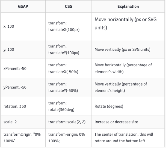
官网形变文档:https://greensock.com/get-started/#transformShorthand
html
<!DOCTYPE html>
<html lang="en">
  <head>
    <meta charset="UTF-8" />
    <meta http-equiv="X-UA-Compatible" content="IE=edge" />
    <meta name="viewport" content="width=device-width, initial-scale=1.0" />
    <title>Document</title>
    <style>
      body,
      ul {
        margin: 0;
        padding: 0;
      }

      body {
        background-image: url(../images/grid.png);
      }
      svg {
        background-color: rgba(255, 0, 0, 0.1);
      }
    </style>
  </head>
  <body>
    <svg width="300" height="300" xmlns="http://www.w3.org/2000/svg">
      <rect
        id="rectangle"
        x="100"
        y="100"
        width="100"
        height="100"
        fill="red"
        onclick="scaleRectangle()"
      ></rect>
    </svg>

    <!--
    window.gsap = {}
   -->
    <script src="./libs/gsap.min.js"></script>
    <script>
      function scaleRectangle() {
        // 1.补间动画( 参数一也是支持数组的 )
        // gsap.to(['#rectangle'], {
        //   scale: 0.5, // 1 - 0.5
        //   duration: 1
        // })

        // gsap.from(['#rectangle'], {
        //   scale: 0.3,  // 0.3 - 1
        //   duration: 1
        // })

        // gsap.fromTo(['#rectangle'],
        //   {
        //     scale: 0,  // 0%
        //     // duration: 4 // 0.5
        //   },
        //   {
        //     scale: 1,  // 100%
        //     duration: 2, // 0.5
        //     repeat:1,
        //   })

        // gsap.to(['#rectangle'], {
        //   scale: 0.5, // 1 - 0.5
        //   duration: 1,
        //   // transformOrigin: 'center'  // 动画的原点
        //   // transformOrigin: 'left'  // 动画的原点
        //   // transformOrigin: 'top'  // 动画的原点
        //   // transformOrigin: 'right'  // 动画的原点
        //   // transformOrigin: 'bottom'  // 动画的原点
        // })

        gsap.to(["#rectangle"], {
          scale: 0.5, // 1 - 0.5
          duration: 1,
          transformOrigin: "center", // 动画的原点
          ease: "bounce.out", // power1.out
        });
      }
    </script>
  </body>
</html>
GSAP 动画时间线(TimeLine)
什么是动画时间线(TimeLine):
- 时间线(TimeLine)是用来创建易于调整、有弹性的动画序列。
- 当我们将补间添加到时间线(Timeline)时,默认情况下,它们会按照添加到时间轴的顺序一个接一个地播放。
TimeLine 的使用步骤:
第一步:通过 gsap.timeline( vars ) 拿到时间线对象
- timeline 文档: https://greensock.com/docs/v3/GSAP/Timeline
第二步:调用时间线上的 Tween 动画方法,比如:form、to 等。
delay
html
<!DOCTYPE html>
<html lang="en">
  <head>
    <meta charset="UTF-8" />
    <meta http-equiv="X-UA-Compatible" content="IE=edge" />
    <meta name="viewport" content="width=device-width, initial-scale=1.0" />
    <title>Document</title>
    <style>
      body,
      ul {
        margin: 0;
        padding: 0;
      }

      body {
        background-image: url(../images/grid.png);
      }
      svg {
        background-color: rgba(255, 0, 0, 0.1);
      }
    </style>
  </head>
  <body>
    <svg width="300" height="300" xmlns="http://www.w3.org/2000/svg">
      <rect
        id="rectangle1"
        x="0"
        y="0"
        width="50"
        height="50"
        fill="red"
        onclick="scaleRectangle()"
      ></rect>
      <rect
        id="rectangle2"
        x="100"
        y="0"
        width="50"
        height="50"
        fill="red"
      ></rect>
      <rect
        id="rectangle3"
        x="200"
        y="0"
        width="50"
        height="50"
        fill="red"
      ></rect>
    </svg>

    <!--
    window.gsap = {}
   -->
    <script src="./libs/gsap.min.js"></script>
    <script>
      function scaleRectangle() {
        // 1 - 3
        gsap.to("#rectangle1", {
          scale: 0.5,
          duration: 1,
        });

        gsap.to("#rectangle2", {
          scale: 0.5,
          duration: 1,
          delay: 1,
        });

        gsap.to("#rectangle3", {
          scale: 0.5,
          duration: 1,
          delay: 2,
        });
      }
    </script>
  </body>
</html>
timeline
html
<!DOCTYPE html>
<html lang="en">
  <head>
    <meta charset="UTF-8" />
    <meta http-equiv="X-UA-Compatible" content="IE=edge" />
    <meta name="viewport" content="width=device-width, initial-scale=1.0" />
    <title>Document</title>
    <style>
      body,
      ul {
        margin: 0;
        padding: 0;
      }

      body {
        background-image: url(../images/grid.png);
      }
      svg {
        background-color: rgba(255, 0, 0, 0.1);
      }
    </style>
  </head>
  <body>
    <svg width="300" height="300" xmlns="http://www.w3.org/2000/svg">
      <rect
        id="rectangle1"
        x="0"
        y="0"
        width="50"
        height="50"
        fill="red"
        onclick="scaleRectangle()"
      ></rect>
      <rect
        id="rectangle2"
        x="100"
        y="0"
        width="50"
        height="50"
        fill="red"
      ></rect>
      <rect
        id="rectangle3"
        x="200"
        y="0"
        width="50"
        height="50"
        fill="red"
      ></rect>
    </svg>

    <!--
    window.gsap = {}
   -->
    <script src="./libs/gsap.min.js"></script>
    <script>
      // 点击执行这个事件
      function scaleRectangle() {
        let timeline = gsap.timeline(); // 动画时间线
        // 并发执行
        timeline
          .to(["#rectangle1", "#rectangle2"], {
            scale: 0.5,
            duration: 1,
          })

          // .to('#rectangle2', {
          //   scale: 0.5,
          //   duration: 1,
          // })

          .to("#rectangle3", {
            scale: 0.5,
            duration: 1,
          });
      }
    </script>
  </body>
</html>
SVG + GSAP 动画

html
<!DOCTYPE html>
<html lang="en">
  <head>
    <meta charset="UTF-8" />
    <meta http-equiv="X-UA-Compatible" content="IE=edge" />
    <meta name="viewport" content="width=device-width, initial-scale=1.0" />
    <title>Document</title>
  </head>
  <body>
    <!-- 滑板车 -->
    <svg
      id="scooter"
      height="512"
      width="512"
      viewBox="0 0 512.004 512.004"
      xmlns="http://www.w3.org/2000/svg"
    >
      <path
        id="footer-block"
        d="m175.669 463.803c-8.283 0-15-6.716-15-15 0-53.743-43.723-97.467-97.467-97.467-14.622 0-28.673 3.153-41.762 9.371-7.483 3.555-16.432.371-19.986-7.112-3.555-7.482-.37-16.431 7.113-19.985 17.143-8.143 35.525-12.273 54.635-12.273 70.286 0 127.467 57.182 127.467 127.467 0 8.283-6.714 14.999-15 14.999z"
        fill="#c5e1e6"
      />
      <path
        id="footboard2"
        d="m442.768 321.476c-63.027 2.945-113.414 51.086-120.563 112.327h-210.801c-8.285 0-15 6.716-15 15s6.715 15 15 15h224.932c8.285 0 15-6.716 15-15 0-52.162 40.777-94.928 92.832-97.36 8.275-.387 14.67-7.408 14.283-15.684-.387-8.275-7.402-14.684-15.683-14.283z"
        fill="#008adf"
      />
      <path
        id="footboard1"
        d="m442.768 321.476c-63.027 2.945-113.414 51.086-120.563 112.327h-66.204v30h80.335c8.285 0 15-6.716 15-15 0-52.162 40.777-94.928 92.832-97.36 8.275-.387 14.67-7.408 14.283-15.684-.387-8.275-7.402-14.684-15.683-14.283z"
        fill="#0065a3"
      />
      <path
        id="scooter-head"
        d="m448.787 415.604c-7.721 0-14.279-5.923-14.932-13.755l-28.796-345.572c-1.291-15.484-11.852-26.275-20.521-26.275-8.283 0-15-6.716-15-15s6.717-15 15-15c12.9 0 25.295 5.971 34.9 16.811 8.852 9.99 14.361 23.12 15.518 36.972l28.797 345.573c.688 8.256-5.447 15.506-13.703 16.194-.425.035-.847.052-1.263.052z"
        fill="#8db9c4"
      />
      <circle id="wheel4" cx="63.203" cy="448.803" fill="#c5e1e6" r="48.2" />
      <path
        id="wheel3"
        d="m63.203 512.002c-34.848 0-63.199-28.351-63.199-63.199 0-34.849 28.352-63.199 63.199-63.199 34.85 0 63.201 28.35 63.201 63.199 0 34.848-28.352 63.199-63.201 63.199zm0-96.398c-18.306 0-33.199 14.893-33.199 33.199 0 18.307 14.894 33.199 33.199 33.199 18.307 0 33.201-14.893 33.201-33.199s-14.895-33.199-33.201-33.199z"
        fill="#1d4659"
      />
      <circle id="wheel2" cx="448.803" cy="448.803" fill="#8db9c4" r="48.2" />
      <g fill="#0e232c">
        <path
          id="wheel1"
          d="m448.803 512.002c-34.848 0-63.199-28.351-63.199-63.199 0-34.849 28.352-63.199 63.199-63.199 34.85 0 63.201 28.35 63.201 63.199 0 34.848-28.352 63.199-63.201 63.199zm0-96.398c-18.307 0-33.199 14.893-33.199 33.199 0 18.307 14.893 33.199 33.199 33.199 18.307 0 33.201-14.893 33.201-33.199s-14.895-33.199-33.201-33.199z"
        />
        <path
          id="head-block"
          d="m352.402.002c-8.283 0-15 6.716-15 15s6.717 15 15 15h32.135v-30h-32.135z"
        />
      </g>
    </svg>
    <script src="./libs/gsap.min.js"></script>
    <script>
      window.onload = function () {
        let tl = gsap.timeline({
          repeat: -1, // 重复的次数
          // yoyo: true // 反向执行动画
        });

        // 1.给车轮做动画
        tl.from(
          [
            "#wheel1", // begin= 0s
            "#wheel2", // 0.2
            "#wheel3", // 0.4
            "#wheel4", // 0.6
          ],
          {
            scaleX: 0,
            scaleY: 0,
            duration: 1,
            transformOrigin: "center",
            ease: "bounce.out",
            stagger: 0.2,
          }
        )

          .from(["#footboard1", "#footboard2"], {
            scaleX: 0,
            duration: 1,
            transformOrigin: "left",
            ease: "bounce.out",
          })

          .from(["#scooter-head"], {
            scaleY: 0,
            duration: 1,
            transformOrigin: "bottom",
            ease: "bounce.out",
          })

          .from(["#head-block", "#footer-block"], {
            scaleX: 0,
            duration: 1,
            transformOrigin: "right",
            ease: "bounce.out",
          });
      };
    </script>
  </body>
</html>