Appearance
深入理解 vertical-align – line boxes
官方文档的翻译:vertical-align 会影响 行内块级元素 在一个 行盒 中垂直方向的位置
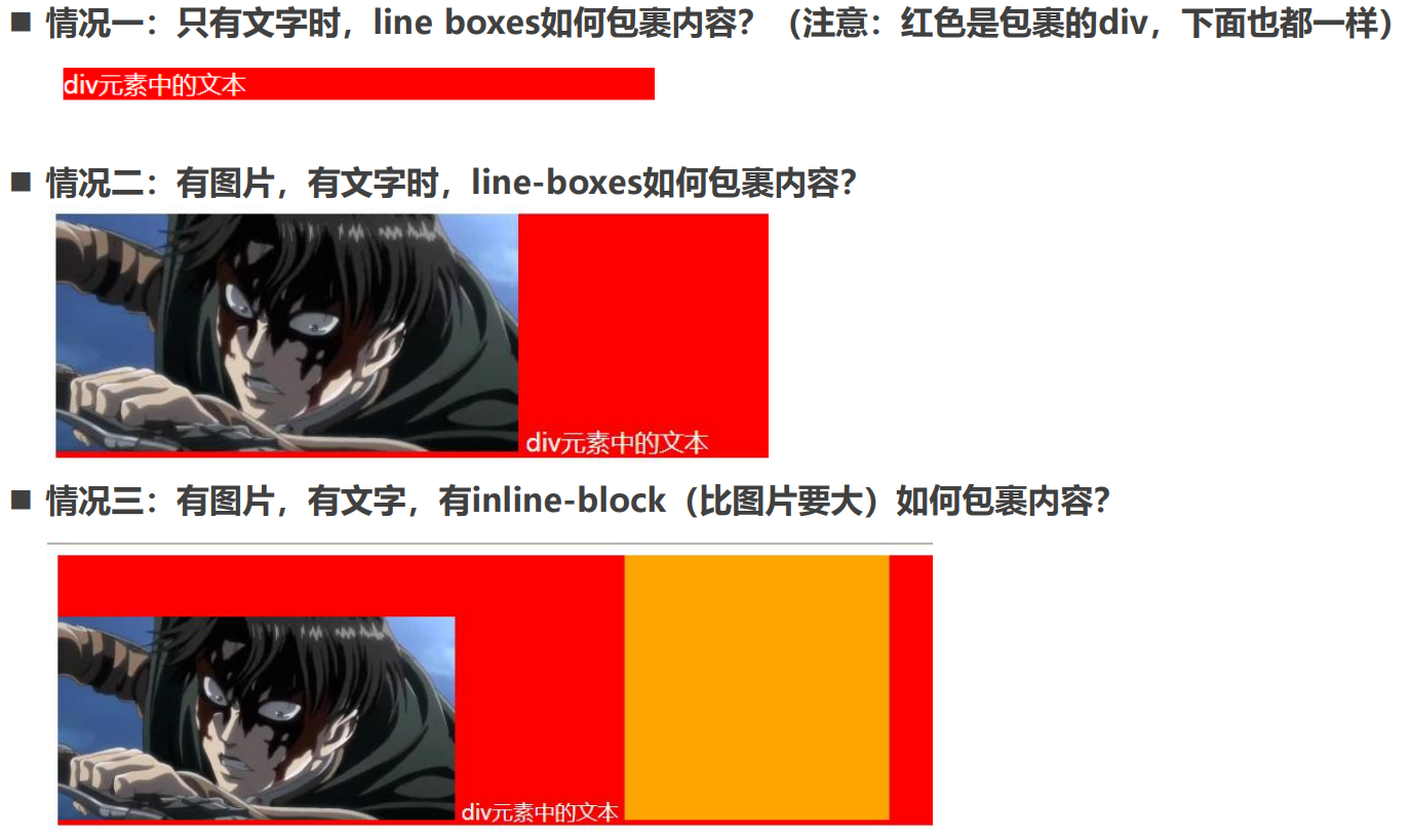
思考:一个 div 没有设置高度的时候,会不会有高度?
- 没有内容,没有高度
- 有内容,内容撑起来高度
但是内容撑起来高度的本质是什么呢?
- 内容有行高(line-height),撑起来了 div 的高度
行高为什么可以撑起 div 的高度?
- 这是因为 line boxes 的存在,并且 line-boxes 有一个特性,包裹每行的 inline level
- 而其中的文字是有行高的,必须将整个行高包裹进去,才算包裹这个 line-level
那么,进一步思考:
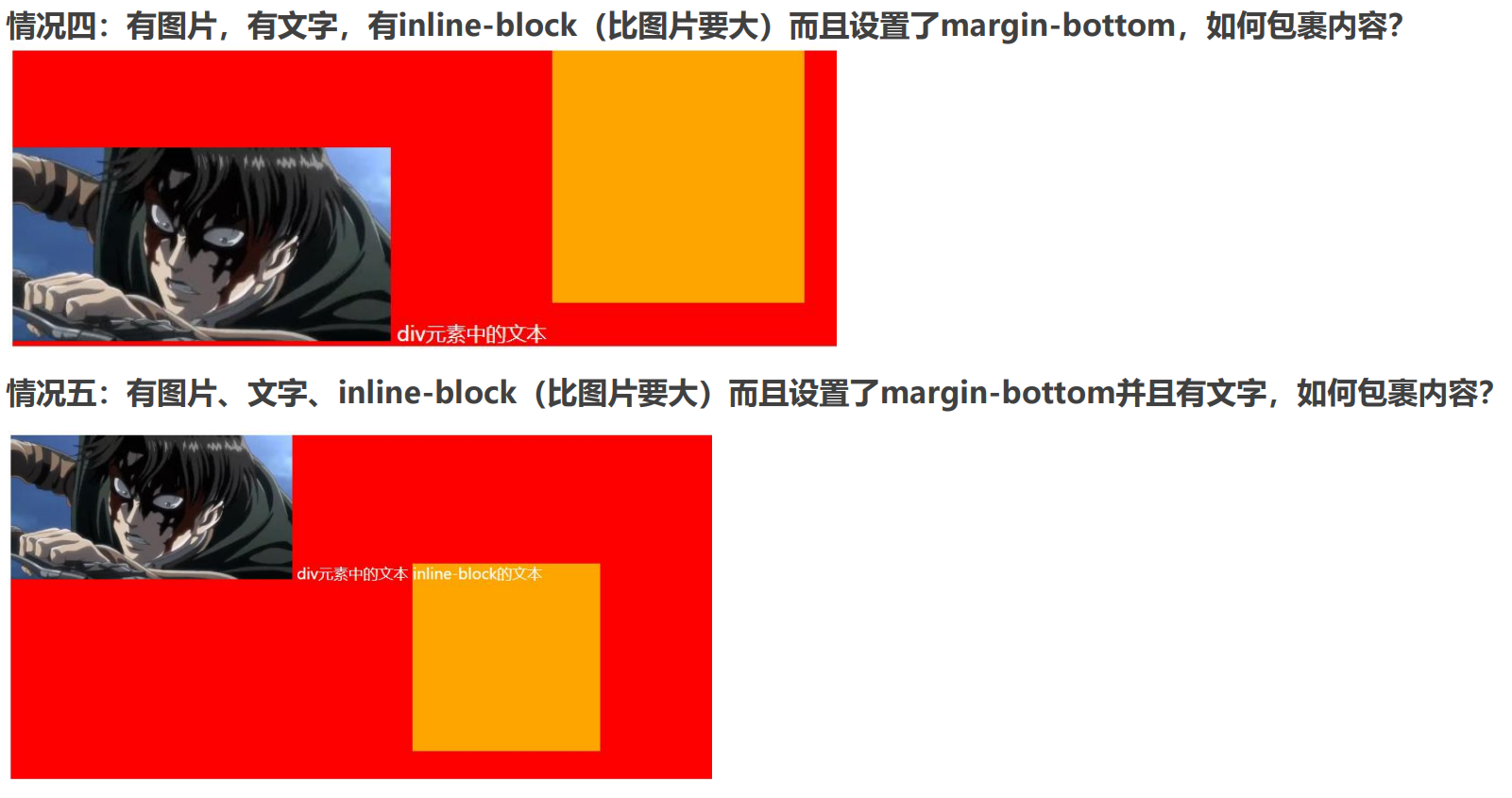
如果这个 div 中有图片,文字,inline-block,甚至他们设置了 margin 这些属性呢?
深入理解 vertical-align – 不同情况分析
vertical-align 的 baseline
结论:line-boxes 一定会想办法包裹住当前行中所有的内容。
但是为什么对齐方式千奇百怪呢?
- 你认为的千奇百怪,其实有它的内在规律
- 答案就是 baseline 对齐
我们来看官方 vertical-align 的默认值:没错,就是 baseline
但是 baseline 都是谁呢?
- 文本的 baseline 是字母 x 的下方
- Inline-block 默认的 baseline 是 margin-bottom 的底部(没有,就是盒子的底部)
- Inline-block 有文本时,baseline 是最后一行文本的 x 的下方
vertical-align 的其他值
现在,对于不同的取值就非常容易理解了
- baseline(默认值):基线对齐(你得先明白什么是基线)
- top:把行内级盒子的顶部跟 line boxes 顶部对齐
- middle:行内级盒子的中心点与父盒基线加上 x-height 一半的线对齐,下图图片和红色线对齐
- bottom:把行内级盒子的底部跟 line box 底部对齐
- <percentage>:把行内级盒子提升或者下降一段距离(距离相对于 line-height 计算\元素高度), 0%意味着同 baseline 一 样
- <length>:把行内级盒子提升或者下降一段距离,0cm 意味着同 baseline 一样
解决图片下边缘的间隙方法:
- 方法一: 设置成 top/middle/bottom
- 方法二: 将图片设置为 block 元素
css
img {
  vertical-align: bottom;
}
CSS 属性 - transform
CSS transform 属性允许你旋转,缩放,倾斜或平移给定元素
Transform 是形变的意思,transformer 就是变形金刚
常见的函数 transform function 有:
- 平移:translate(x, y)
- 缩放:scale(x, y)
- 旋转:rotate(deg)
- 倾斜:skew(deg, deg)
通过上面的几个函数,我们可以改变某个元素的形变
位移 - translate
平移:translate(x, y)
值个数
- 一个值时,设置 x 轴上的位移
- 二个值时,设置 x 轴和 y 轴上的位移
值类型:
- 数字:100px
- 百分比:参照元素本身( refer to the size of bounding box )
css
transform: translate(100px, 100px);缩放 - scale
缩放:scale(x, y)
值个数
- 一个值时,设置 x 轴上的缩放
- 二个值时,设置 x 轴和 y 轴上的缩放
值类型:
- 数字:
- 1:保持不变
- 2:放大一倍
- 0.5:缩小一半
- 百分比:不支持百分比
css
transform: scale(1.1, 1.1);transform-origin
transform-origin:变形的原点
一个值:
设置 x 轴的原点
两个值:
设置 x 轴和 y 轴的原点
必须是<length>,<percentage>,或 left, center, right, top, bottom 关键字中的一个
- left, center, right, top, bottom 关键字
- length:从左上角开始计算
- 百分比:参考元素本身大小
x-offset-keyword
left,right或center中之一,定义相对应的变形中心偏移
y-offset-keyword
top,bottom或center中之一,定义相对应的变形中心偏移
css
transform-origin: center top;缩放 - rotate
旋转:rotate(deg)
值个数
一个值时,表示旋转的角度
值类型:
- deg:旋转的角度
- 正数为顺时针
- 负数为逆时针
注意:旋转的原点受 transform-origin 的影响
css
transform: rotate(-45deg);倾斜 - skew
旋转:skew(x, y)
值个数
- 一个值时,表示 x 轴上的倾斜
- 二个值时,表示 x 轴和 y 轴上的倾斜
值类型:
- deg:倾斜的角度
- 正数为顺时针
- 负数为逆时针
注意:旋转的原点受 transform-origin 的影响
css
transform: skew(10deg, 10deg);过渡动画 - transition
transition CSS 属性是 transition-property,transition-duration,transition-timing-function 和 transition-delay 的 一个简写属性。
transition-property:指定应用过渡属性的名称
- 可以写 all 表示所有可动画的属性
- 属性是否支持动画查看文档
css
transition-property: transform, left;
transition-property: all;
transition-duration:指定过渡动画所需的时间
- 单位可以是秒(s)或毫秒(ms)
transition-timing-function:指定动画的变化曲线
transition-delay:指定过渡动画执行之前的等待时间
简写属性:
css
transition: all 1s ease-in 1s;关键帧动画
之前我们学习了 transition 来进行过渡动画,但是过渡动画只能控制首尾两个值:
- 从关键帧动画的角度相当于只是定义了两帧的状态:第一帧和最后一帧
- 如果我们希望可以有更多状态的变化,可以直接使用关键帧动画
关键帧动画使用@keyframes 来定义多个变化状态,并且使用 animation-name 来声明匹配:
- 使用 @keyframes 创建一个规则
- @keyframes 中使用百分比定义各个阶段的样式
- 通过 animation 将动画添加到属性上
另外,也可以使用 from 和 to 关键字:
- from 相当于 0%
- to 相当于 100%
animation 属性
CSS animation 属性是 animation-name,animation-duration, animation-timing-function,animation-delay,animationiteration-count,animation-direction,animation-fill-mode 和 animation-play-state 属性的一个简写属性形
- animation-name:指定执行哪一个关键帧动画
- animation-duration:指定动画的持续时间
- animation-timing-function:指定动画的变化曲线
- animation-delay:指定延迟执行的时间
- animation-iteration-count:指定动画执行的次数,执行 infinite 表示无限动画
- animation-direction:指定方向,常用值 normal 和 reverse
- animation-fill-mode:执行动画最后保留哪一个值
- none:回到没有执行动画的位置
- forwards:动画最后一帧的位置
- backwards:动画第一帧的位置
- animation-play-state:指定动画运行或者暂停(在 JavaScript 中使用,用于暂停动画)
css
@keyframes moveAnim {
  0% {
    transform: translate(0, 0) scale(0.5, 0.5);
  }

  33% {
    transform: translate(0, 200px) scale(1.2, 1.2);
  }

  66% {
    transform: translate(400px, 200px) scale(1, 1);
  }

  100% {
    transform: translate(400px, 0) scale(0.5, 0.5);
  }
}

.box {
  animation: moveAnim 3s linear 1s 2 normal forwards;
}