Appearance
小程序组件化开发
小程序在刚刚推出时是不支持组件化的, 也是为人诟病的一个点:
但是从 v1.6.3 开始, 小程序开始支持自定义组件开发, 也让我们更加方便的在程序中使用组件化.
组件化思想的应用:
有了组件化的思想,我们在之后的开发中就要充分的利用它。
尽可能的将页面拆分成一个个小的、可复用的组件。
这样让我们的代码更加方便组织和管理,并且扩展性也更强。
所以,组件是目前小程序开发中,非常重要的一个篇章,要认真学习(不过学习 Vue 的过程中我们已经强调过很多次了)。
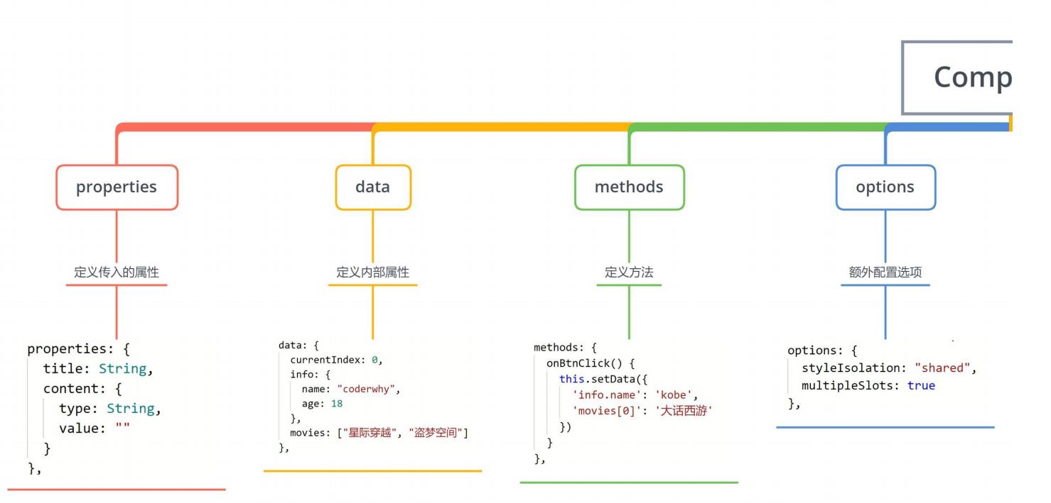
创建一个组件
类似于页面,自定义组件由 json wxml wxss js 4 个文件组成。
按照我的个人习惯, 我们会先在根目录下创建一个文件夹;
components, 里面存放我们之后自定义的公共组件;
常见一个自定义组件 my-cpn: 包含对应的四个文件;
自定义组件的步骤:
1.首先需要在 json 文件中进行自定义组件声明(将 component 字段设为 true 可这一组文件设为自定义组件)
2.在 wxml 中编写属于我们组件自己的模板
3.在 wxss 中编写属于我们组件自己的相关样式
4.在 js 文件中, 可以定义数据或组件内部的相关逻辑(后续我们再使用)
新建一个 components 文件夹,然后新建一个 section-info 目录,在这个目录,鼠标右键新建 Component 就会生成 4 个文件,
其中 section-info.json
json
{
  "component": true, // 代表这个是组件
  "usingComponents": {} // 组件也可以使用其他的组件
}
和页面不一样的地方还有 section-info.js,使用 Component 方法
javascript
Component({});使用自定义组件和细节注意事项
一些需要注意的细节:
自定义组件也是可以引用自定义组件的,引用方法类似于页面引用自定义组件的方式(使用 usingComponents 字段)。
自定义组件和页面所在项目根目录名 不能以“wx-”为前缀,否则会报错。
如果在 app.json 的 usingComponents 声明某个组件,那么所有页面和组件可以直接使用该组件。
在页面的 json 文件先注册才能使用
index.json
json
{
  "usingComponents": {
    "section-info": "/components/section-info/section-info"
  }
}
index.wxml
html
<section-info />组件的样式细节
课题一:组件内的样式 对 外部样式 的影响
结论一:组件内的 class 样式,只对组件 wxml 内的节点生效, 对于引用组件的 Page 页面不生效。
结论二:组件内不能使用 id 选择器、属性选择器、标签选择器
课题二:外部样式 对 组件内样式 的影响
结论一:外部使用 class 的样式,只对外部 wxml 的 class 生效,对组件内是不生效的
结论二:外部使用了 id 选择器、属性选择器不会对组件内产生影响
结论三:外部使用了标签选择器,会对组件内产生影响
课题三:如何让 class 可以相互影响
在 Component 对象中,可以传入一个 options 属性,其中 options 属性中有一个 styleIsolation(隔离)属性。
styleIsolation 有三个取值:
- isolated 表示启用样式隔离,在自定义组件内外,使用 class 指定的样式将不会相互影响(默认取值);
- apply-shared 表示页面 wxss 样式将影响到自定义组件,但自定义组件 wxss 中指定的样式不会影响页面;
- shared 表示页面 wxss 样式将影响到自定义组件,自定义组件 wxss 中指定的样式也会影响页面和其他设置了
components/test-style/test-style.js
javascript
Component({
  options: {
    styleIsolation: "shared",
  },
});
组件的通信
很多情况下,组件内展示的内容(数据、样式、标签),并不是在组件内写死的,而是可以由使用者来决定。
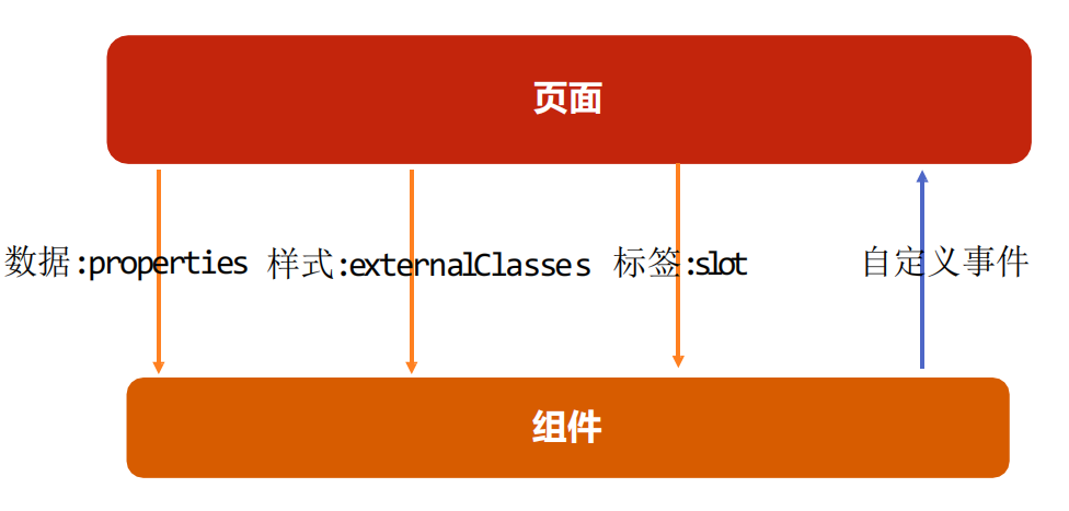
向组件传递数据 - properties
给组件传递数据:
大部分情况下,组件只负责布局和样式,内容是由使用组件的对象决定的;
所以,我们经常需要从外部传递数据给我们的组件,让我们的组件来进行展示;
如何传递呢?
使用 properties 属性;
支持的类型:
String、Number、Boolean
Object、Array、null(不限制类型)
默认值:
可以通过 value 设置默认值;
index.wxml
html
<section-info title="我与地坛" content="要是有些事情我没说, 别以为是我忘记了" />components/section-info/section-info.js
javascript
Component({
  properties: {
    title: {
      type: String,
      value: "默认标题",
    },
    content: {
      type: String,
      value: "默认内容",
    },
  },
});
components/section-info/section-info.wxml
html
<view class="section">
  <view class="title">{{ title }}</view>
  <view class="content">{{ content }}</view>
</view>
向组件传递样式 - externalClasses
给组件传递样式:
有时候,我们不希望将样式在组件内固定不变,而是外部可以决定样式。
这个时候,我们可以使用 externalClasses 属性:
1.在 Component 对象中,定义 externalClasses 属性
2.在组件内的 wxml 中使用 externalClasses 属性中的 class
3.在页面中传入对应的 class,并且给这个 class 设置样式
在页面内使用组件,定义了 abc 和 cba 的样式,把这俩样式传递给组件
index.wxml
html
<!-- 2.自定义组件 -->
<section-info
  info="abc"
  title="我与地坛"
  content="要是有些事情我没说, 别以为是我忘记了"
/>
<section-info
  info="cba"
  title="黄金时代"
  content="在我一生中最好的黄金时代, 我想吃, 我想爱"
/>
index.wxss
css
.abc {
  background-color: #0f0;
}

.cba {
  background-color: #00f;
}
components/section-info/section-info.js
javascript
Component({
  externalClasses: ["info"],
});
components/section-info/section-info.wxml
html
<view class="section">
  <view class="title">{{ title }}</view>
  <view class="content info">{{ content }}</view>
</view>
组件向外传递事件 – 自定义事件
有时候是自定义组件内部发生了事件,需要告知使用者,这个时候可以使用自定义事件:
components/section-info/section-info.wxml
html
<!--components/section-info/section-info.wxml-->
<view class="section">
  <view class="title" bindtap="onTitleTap">{{ title }}</view>
  <view class="content info">{{ content }}</view>
</view>
components/section-info/section-info.js
javascript
Component({
  methods: {
    onTitleTap() {
      console.log("title被点击了~");
      this.triggerEvent("titleclick", "aaa");
    },
  },
});
index.wxml
html
<section-info
  info="abc"
  title="我与地坛"
  content="要是有些事情我没说, 别以为是我忘记了"
  bind:titleclick="onSectionTitleClick"
/>
index.js
javascript
Page({
  onSectionTitleClick(event) {
    console.log("区域title发生了点击", event.detail);
  },
});
自定义组件练习
index.wxml
html
<!-- 4.tab-control的使用 -->
<tab-control titles="{{digitalTitles}}" bind:indexchange="onTabIndexChange" />
index.js
javascript
// pages/07_learn_cpns/index.js
Page({
  data: {
    digitalTitles: ["电脑", "手机", "iPad"],
  },
  onTabIndexChange(event) {
    const index = event.detail;
    console.log("点击了", this.data.digitalTitles[index]);
  },
});
components/tab-control/tab-control.wxml
html
<view class="tab-control">
  <block wx:for="{{ titles }}" wx:key="*this">
    <view
      class="item {{index === currentIndex ? 'active': ''}}"
      bindtap="onItemTap"
      data-index="{{index}}"
    >
      <text class="title">{{ item }}</text>
    </view>
  </block>
</view>
components/tab-control/tab-control.wxss
css
.tab-control {
  display: flex;
  height: 40px;
  line-height: 40px;
  text-align: center;
}

.tab-control .item {
  flex: 1;
}

.tab-control .item.active {
  color: #ff8189;
}

.tab-control .item.active .title {
  border-bottom: 3px solid #ff8189;
  padding: 5px;
}
components/tab-control/tab-control.js
javascript
Component({
  properties: {
    titles: {
      type: Array,
      value: [],
    },
  },

  data: {
    currentIndex: 0,
  },

  methods: {
    onItemTap(event) {
      const currentIndex = event.currentTarget.dataset.index;
      this.setData({ currentIndex });

      // 自定义事件
      this.triggerEvent("indexchange", currentIndex);
    },
  },
});
页面直接调用组件方法
可在父组件里调用 this.selectComponent ,获取子组件的实例对象。
调用时需要传入一个匹配选择器 selector,如:this.selectComponent(".my-component")。
index.wxml
html
<tab-control
  class="tab-control"
  titles="{{digitalTitles}}"
  bind:indexchange="onTabIndexChange"
/>
<button bindtap="onExecTCMethod">调用TC方法</button>
index.js
javascript
Page({
  onExecTCMethod() {
    // 1.获取对应的组件实例对象
    const tabControl = this.selectComponent(".tab-control");

    // 2.调用组件实例的方法
    tabControl.test(2);
  },
});
components/tab-control/tab-control.js
javascript
Component({
  data: {
    currentIndex: 0,
  },
  methods: {
    test(index) {
      console.log("tab control test function exec");
      this.setData({
        currentIndex: index,
      });
    },
  },
});
什么是插槽?
slot 翻译为插槽:
在生活中很多地方都有插槽,电脑的 USB 插槽,插板当中的电源插槽。
插槽的目的是让我们原来的设备具备更多的扩展性。
比如电脑的 USB 我们可以插入 U 盘、硬盘、手机、音响、键盘、鼠标等等。
组件的插槽:
组件的插槽也是为了让我们封装的组件更加具有扩展性。
让使用者可以决定组件内部的一些内容到底展示什么。
栗子:移动网站中的导航栏。
移动开发中,几乎每个页面都有导航栏。
导航栏我们必然会封装成一个插件,比如 nav-bar 组件。
一旦有了这个组件,我们就可以在多个页面中复用了。
但是,每个页面的导航是一样的吗?类似右图
单个插槽的使用
除了内容和样式可能由外界决定之外,也可能外界想决定显示的方式
比如我们有一个组件定义了头部和尾部,但是中间的内容可能是一段文字,也可能是一张图片,或者是一个进 度条。
在不确定外界想插入什么其他组件的前提下,我们可以在组件内预留插槽:
index.wxml
html
<my-slot>
  <button>我是按钮</button>
</my-slot>
<my-slot>
  <image src="/assets/nhlt.jpg" mode="widthFix"></image>
</my-slot>

<my-slot></my-slot>
components/my-slot/my-slot.wxml
微信小程序插槽是不支持默认值的,那么如何解决呢?我们可以在 content 后面定义一个默认值,通过 CSS 样式来控制是否展示默认值,
默认 default 的样式是 display: none,当 content 没有内容时,它的兄弟选择器也就是 default,样式改成 display: block
html
<view class="my-slot">
  <view class="header">Header</view>
  <view class="content">
    <!-- 小程序中插槽是不支持默认值的 -->
    <slot></slot>
  </view>
  <view class="default">哈哈哈哈</view>
  <view class="footer">Footer</view>
</view>
components/my-slot/my-slot.wxss
css
.default {
  display: none;
}

.content:empty + .default {
  display: block;
}
多个插槽的使用
有时候为了让组件更加灵活, 我们需要定义多个插槽:
index.wxml
html
<!-- 2.多个插槽的使用 -->
<mul-slot>
  <button slot="left" size="mini">left</button>
  <view slot="center">哈哈哈</view>
  <button slot="right" size="mini">right</button>
</mul-slot>
components/mul-slot/mul-slot.wxml
html
<!--components/mul-slot/mul-slot.wxml-->
<view class="mul-slot">
  <view class="left">
    <slot name="left"></slot>
  </view>
  <view class="center">
    <slot name="center"></slot>
  </view>
  <view class="right">
    <slot name="right"></slot>
  </view>
</view>
components/mul-slot/mul-slot.js
注意:这里需要开启使用多个插槽
javascript
Component({
  options: {
    multipleSlots: true,
  },
});
behaviors
behaviors 是用于组件间代码共享的特性,类似于一些编程语言中的 “mixins”。
每个 behavior 可以包含一组属性、数据、生命周期函数和方法;
组件引用它时,它的属性、数据和方法会被合并到组件中,生命周期函数也会在对应时机被调用;
每个组件可以引用多个 behavior ,behavior 也可以引用其它 behavior ;
components/c-behavior/c-behavior.wxml
html
<view>
  <view class="counter">当前计数: {{counter}}</view>
  <button bindtap="increment">+1</button>
  <button bindtap="decrement">-1</button>
</view>
components/c-behavior/c-behavior.js
javascript
import { counterBehavior } from "../../behaviors/counter";

Component({
  behaviors: [counterBehavior],
});
behaviors/counter.js
javascript
export const counterBehavior = Behavior({
  data: {
    counter: 100,
  },
  methods: {
    increment() {
      this.setData({ counter: this.data.counter + 1 });
    },
    decrement() {
      this.setData({ counter: this.data.counter - 1 });
    },
  },
});
组件的生命周期
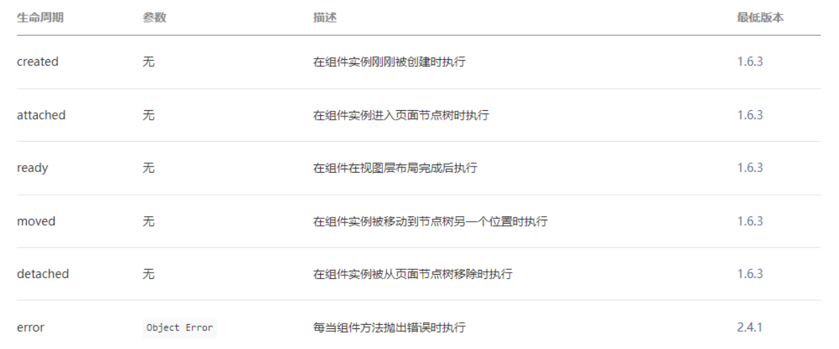
组件的生命周期,指的是组件自身的一些函数,这些函数在特殊的时间点或遇到一些特殊的框架事件时被自动触发。
其中,最重要的生命周期是 created attached detached ,包含一个组件实例生命流程的最主要时间点。
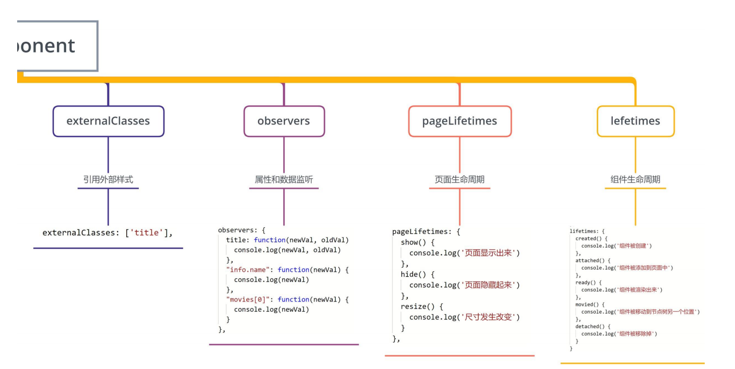
自小程序基础库版本 2.2.3 起,组件的的生命周期也可以在 lifetimes 字段内进行声明(这是推荐的方式,其优先级最高)。
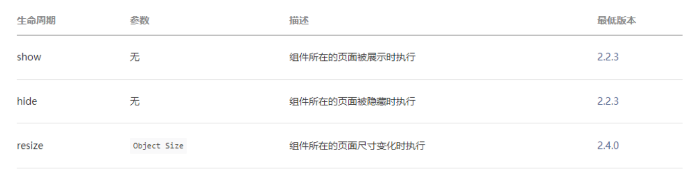
组件所在页面的生命周期
还有一些特殊的生命周期,它们并非与组件有很强的关联,但有时组件需要获知,以便组件内部处理。
样的生命周期称为“组件所在页面的生命周期”,在 pageLifetimes 定义段中定义。
其中可用的生命周期包括:
components/c-lifetime/c-lifetime.js
javascript
// components/c-lifetime/c-lifetime.js
Component({
  lifetimes: {
    created() {
      console.log("组件被创建created");
    },
    attached() {
      console.log("组件被添加到组件树中attached");
    },
    detached() {
      console.log("组件从组件树中被移除detached");
    },
  },
  pageLifetimes: {
    show() {
      console.log("page show");
    },
    hide() {
      console.log("page hide");
    },
  },
});
index.wxml
html
<!-- 4.组件的生命周期 -->
<button bindtap="onChangeTap">切换</button>
<c-lifetime wx:if="{{isShowLiftTime}}" />
index.js
javascript
Page({
  data: {
    isShowLiftTime: true,
  },
  onChangeTap() {
    this.setData({ isShowLiftTime: !this.data.isShowLiftTime });
  },
});
Component 构造器